Dining room wall decor runs from a single can of charcoal paint to a plate display you hang in an afternoon.
What separates one idea from another is whether you own the wall or answer to a landlord: renters get peel-and-stick wallpaper and floating shelves with patchable holes, while owners can paper with grasscloth or mount plate hangers that need real anchors.
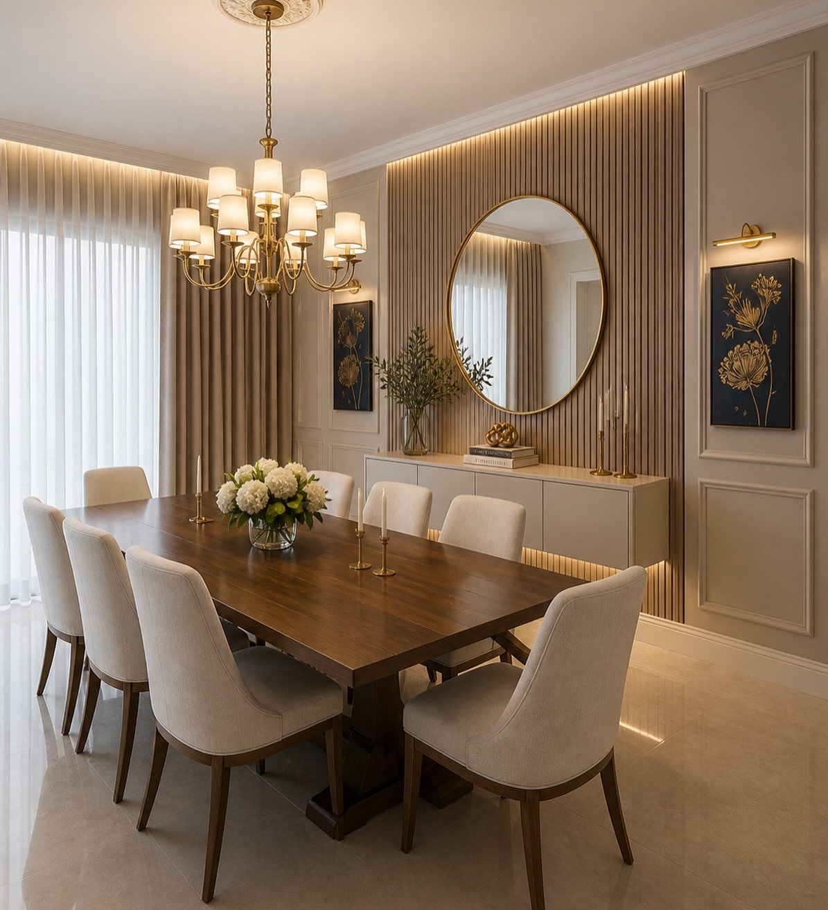
The battery-powered sconces with rechargeable flameless candles prove the list was built for people who eat dinner there, not just photograph it.
1. Framed Art & Prints
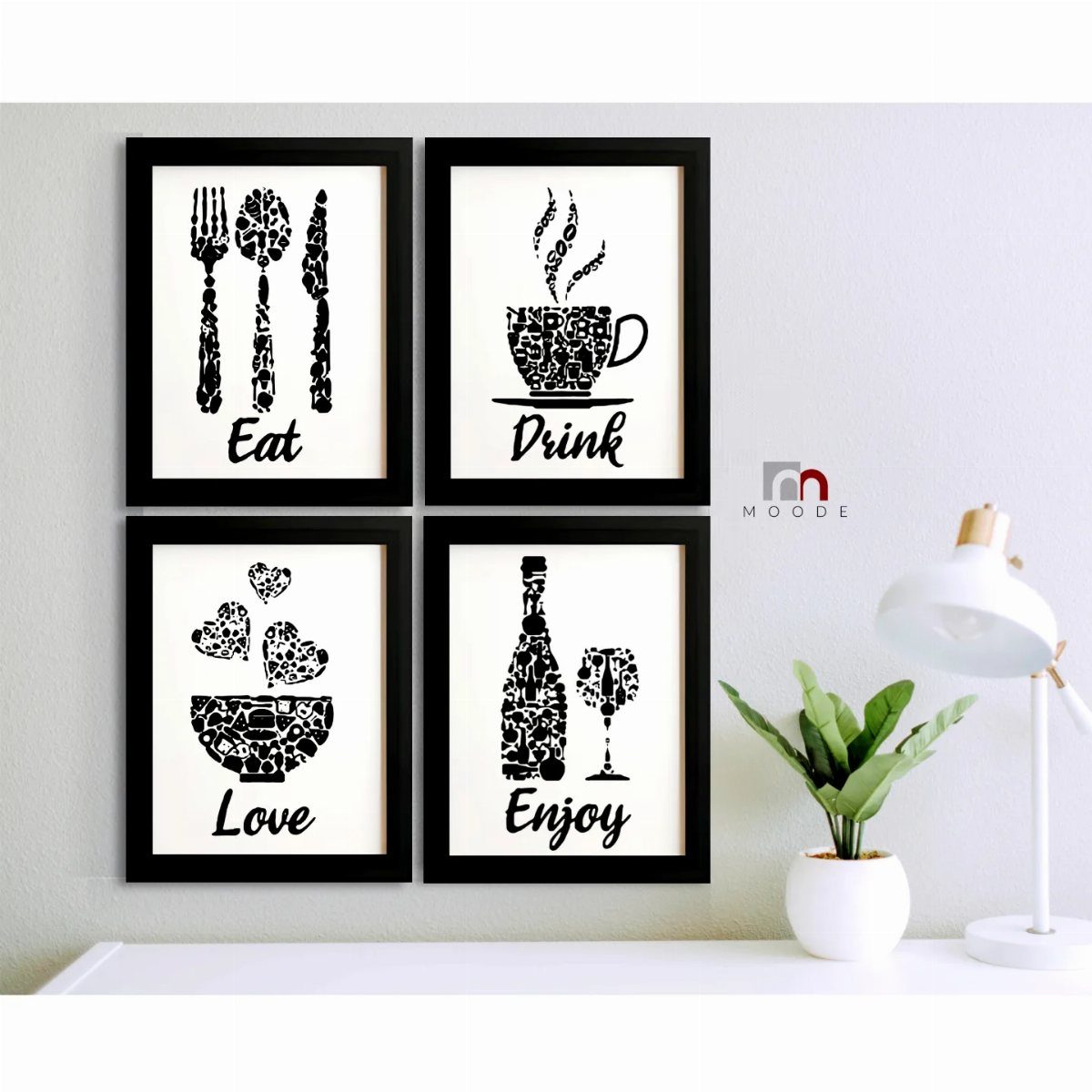
Matching prints over a table is the easiest win in dining room wall decor. The frame color ties them together even when the art inside changes.
Botanical prints read fresh and slightly formal. Geometric patterns suit a cleaner, more modern table.
Abstract art works when your chairs already have personality. If the budget is tight, printable downloads and matching frames from a craft store gets it done in an afternoon.
Word art walks a thin line; choose something you will not tire of by next season. It works here because the silhouettes are simple and the frames are slim.
Anything busier would feel like a café menu.

Vintage Olive Branch Wall Art: Featuring graceful olive branches, green olives, and rich oil painting textures, this timeless still life artwork brings peace, warmth, and Mediterranean charm to any space

2. Statement Wallpaper
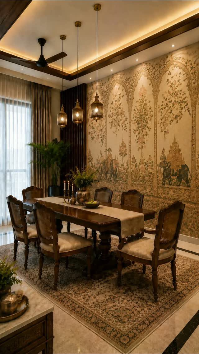
A single wall of pattern does what paint on every wall cannot.
An elephant and botanical motif that reads as a mural rather than repeating wallpaper is the effect to look for if your table sits against a solid block of wall.
Peel-and-stick options have improved enough that renters can get away with this now. Grasscloth adds texture for a more subdued look; stripes elongate a room where the table runs lengthwise.
Treat the papered wall as the art and keep everything else quiet.
I’d only paper the wall the table faces. Doing the whole room turns dinner into a trip somewhere else.

Warm Tips: Colors may vary slightly due to different lighting conditions and screen settings. We recommend purchasing enough rolls at once to ensure they come from the same batch for a consistent color match. Apply to a clean, dry, and smooth surface for the best adhesion

1.Large floral wallpaper featuring botanical flowers on a dark background creates a luxurious vintage garden atmosphere. Perfect for bedrooms, living rooms, dining rooms and accent walls. Made of self-adhesive waterproof vinyl.

Unique Design: This boho wallpaper features a soft beige and light brown leaf pattern on a white background, accented with geometric lines, adding natural elegance and vibrant energy to your space
3. Wall Sconces
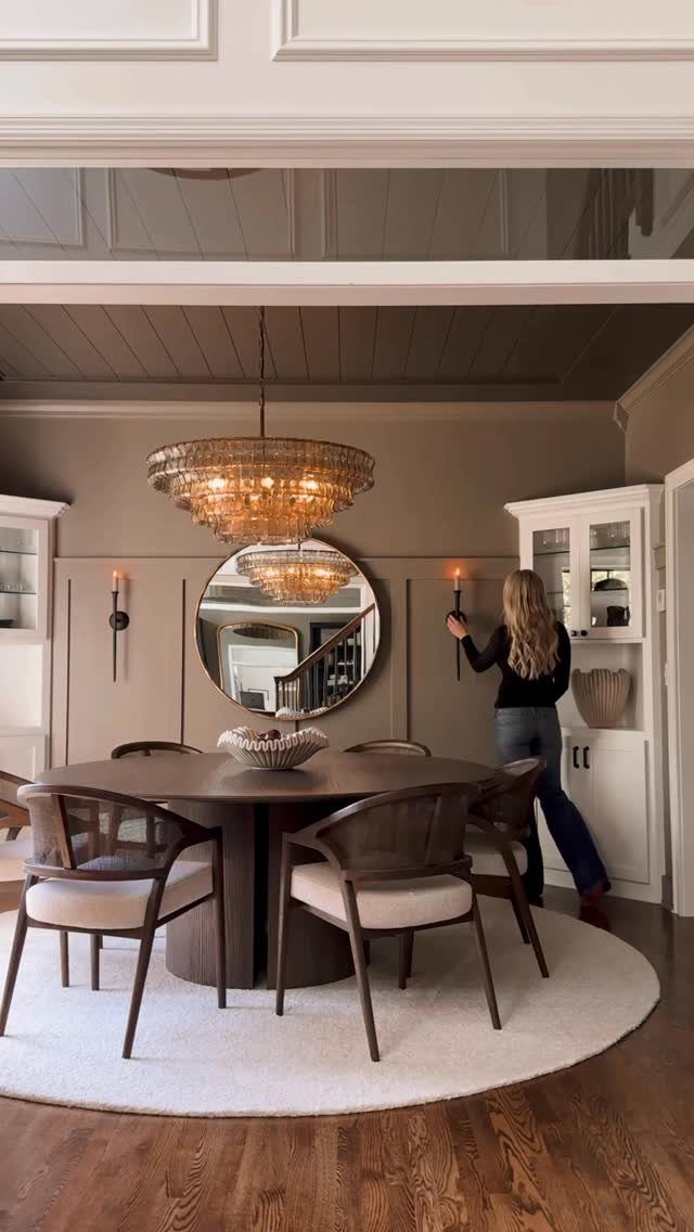
Candle sconces are the rare wall piece that works harder once the lights go down. Brass or aged metal finish picks up the chandelier and warms the whole room without adding another electrical box.
Battery-powered flameless candles have come far enough that the flicker looks real from across a table. Rechargeable ones save the constant battery swap.
Place them where someone standing up might reach one to adjust it; the interaction is half the point.
Renters should look for cordless rechargeable sconces that mount with a single screw or sit on a narrow ledge. The effect is nearly the same and the deposit stays safe.

Outdoor waterproof candles: Biyanuo outdoor waterproof flameless candle, made of high-quality waterproof plastic material, with a waterproof rubber ring at the bottom, which can effectively prevent water ingress. Don't worry about melting due to the hot weather, it can withstand rain and cold winters

LIFELIKE FLICKERING CANDLELIGHT: The warm white glow flickers like a real candle from across the room, while the melted-edge design adds realistic detail up close; create cozy candlelight across votive holders, table centerpieces, mantels and seasonal displays

Realistic 3D Flame Effect: These 6.7 inch remote taper candles feature a vivid 3D flickering flame and warm yellow glow, creating a lifelike ambiance. Made of durable plastic, they won't melt, crack, or fade over time for year-round elegance
4. Think Outside the Frame
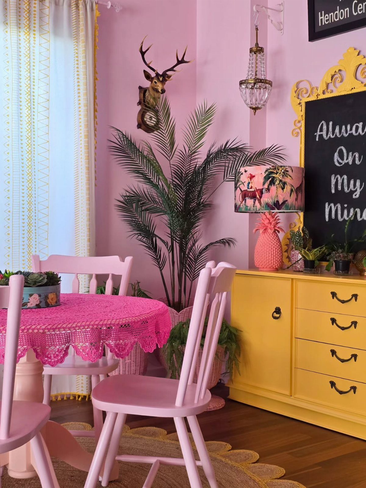
A chalkboard and a wall-mounted clock shaped like a deer head share one thing: neither started life as dining room decor. That is exactly why they work in a room that can feel too planned.
Woven wall baskets, a single large ceramic plate, or a textile hung from a dowel all do the same job of breaking the rectangle habit. An ornate frame lets a chalkboard read as intentional rather than leftover.
This approach suits the collector more than the shopper. One piece from a trip, one from a relative, one found object: the wall becomes storage for what you already own.
The risk is clutter, so the background color needs to stay flat. Pink is brave; white or cream forgives more.

DISPLAYS PLATES ON THE WALL: This plate hanger shows off decorative plates, china, and platters on the wall, using spring-tension wire arms that grip the plate edges and hold it flat and level without drilling into the plate itself.

Four-Tier Vertical Design: Maximizes wall display space with four spacious tiers for organizing and showcasing multiple items in a clean arrangement

WHAT YOU WILL GET: Our package includes 20 functional hooks for hanging pictures, decorative plates, photo frames and art. Large amount is enough for your daily usage and replacement, you can also share these wall plate hangers with your families and friends.
5. Mirrors
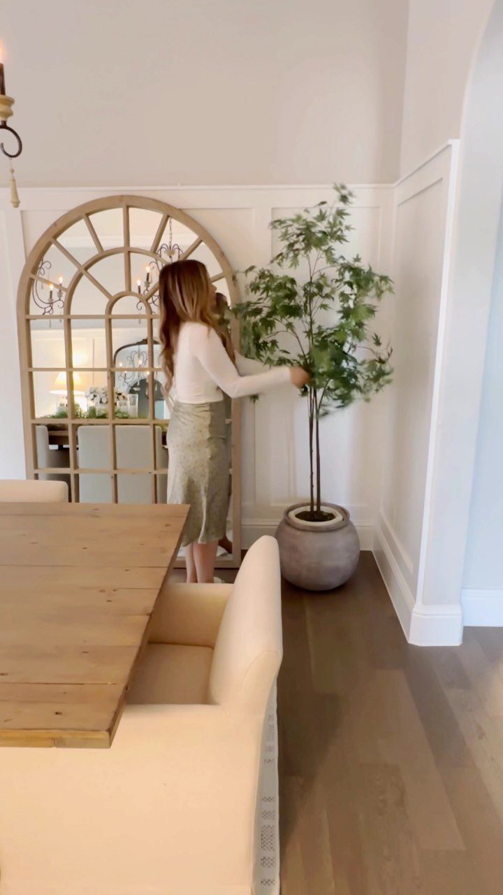
An arched windowpane mirror leaning against the wall rather than hung is a move worth copying. It sits at eye level from a standing position, which means the reflection catches people and light across the room, not just the ceiling.
A single large mirror works when the wall behind it is quiet. Several smaller mirrors, grouped like a gallery, suit a wall that already has trim or wainscoting to break up.
Windowpane style adds architecture where there is none.
Opposite a window, this nearly doubles the daylight. On the same wall as a window, it does almost nothing.
Check your wall before you buy.
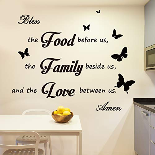
Package Includes: you will get 3 sheets of kitchen quote stickers, including [ Bless the food before us, the family beside us, and the love between us] , and each sheet is about 11 x 10.2 inches/ 28 x 26 cm

Package includes: you will receive 5 pieces kitchen wall signs and 50 pieces foam double-sided tape, which respectively are the letters Let's and eat, a knife, a fork, and a spoon; Nice combination will bring you a good appetite and become delicate decorations in your kitchen

Delicate Design: welcome family and friends into your kitchen or dining space with our charming cutting board eat sign; Each letter is displayed on its own individual sign that's been creatively designed in the shape of a kitchen cutting board
6. Dark Paint Dining Room Wall
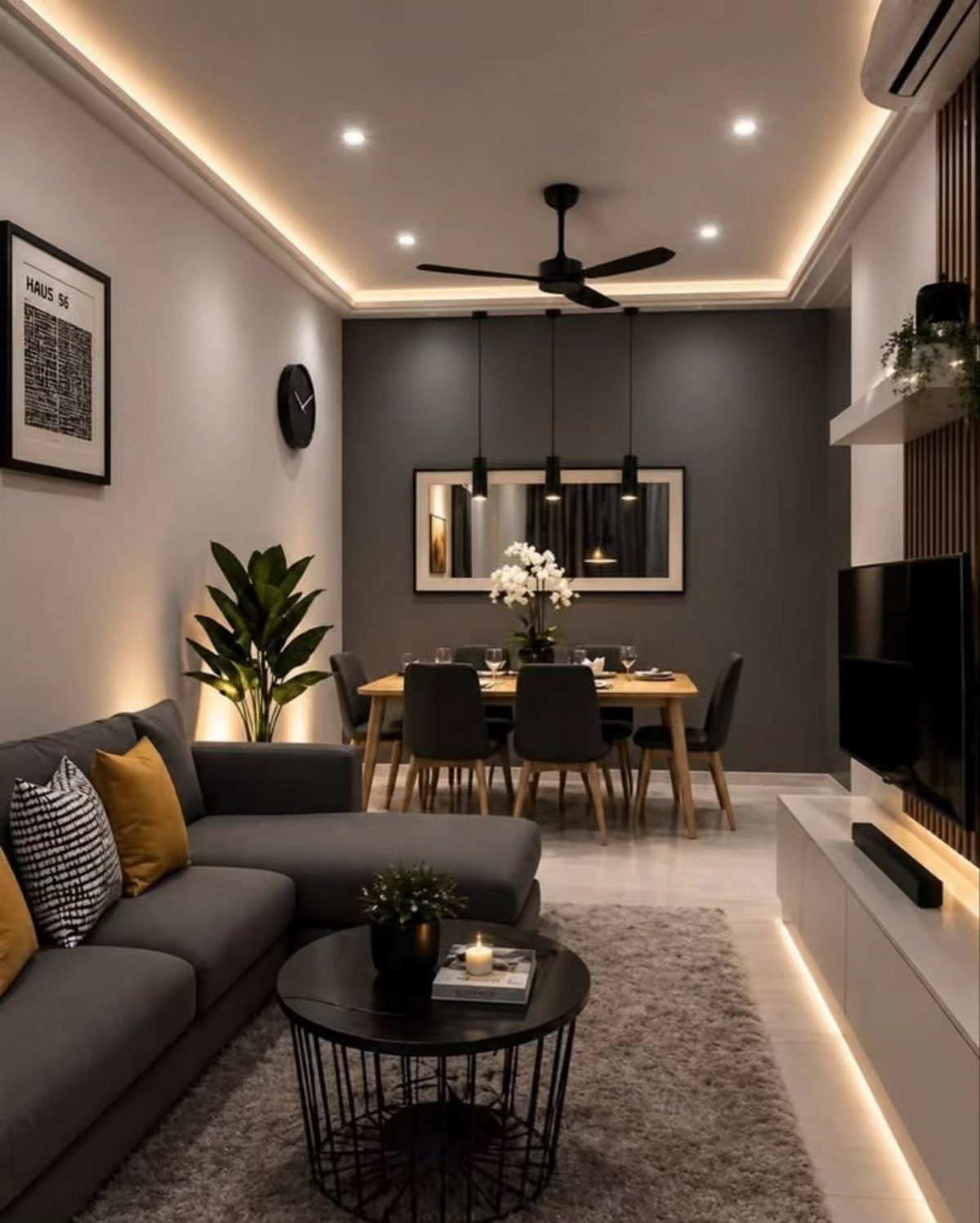
Dark paint reads as wall decor because it changes how everything in front of it behaves. Charcoal makes the wood table feel richer and black pendants disappear into shadow rather than floating.
Federal Blue, deep green, or charcoal gray all do the same work of flattening the wall into a backdrop. Same color in two sheens, matte above and satin below, catches light without adding a second hue.
This trades away the airy breakfast feeling. If your dining room is also your morning coffee spot, keep it lighter.

Botanical Wall Art Set of 4: Refresh your home with this set of four 11x14 inch vintage hydrangea wall art pieces featuring stylish bamboo inspired frames and nature-inspired artwork.

Size:12x26inchx2panel, 12x35inchx2panel, all 4 panels.

Natural Botanical Design This wall art set features elegant wild grasses and botanical elements in a soft neutral palette, creating a calm and organic atmosphere that suits modern, farmhouse, and minimalist interiors
7. Plate Display
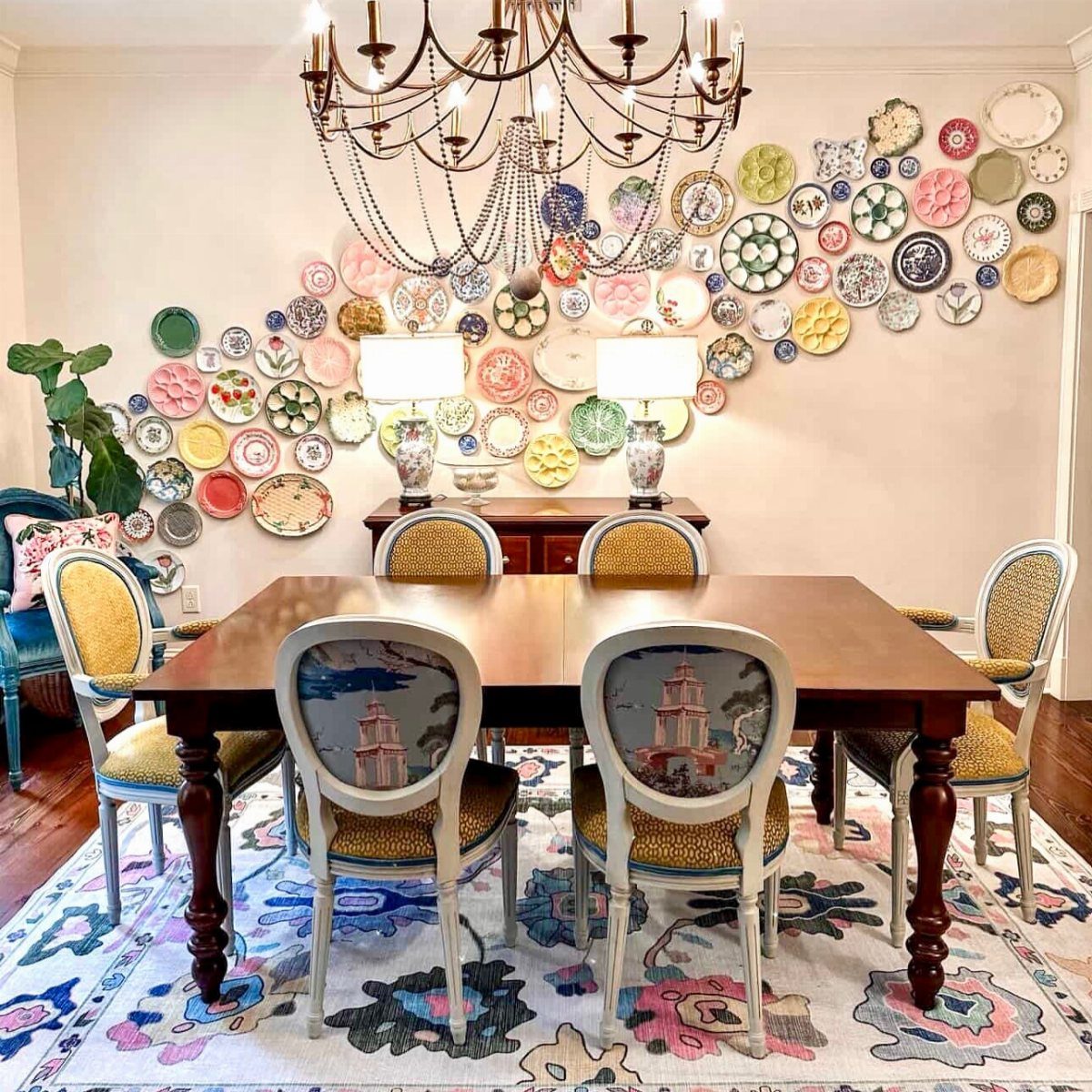
Plates read as geometry, color, or story depending on which ones you pick and how you set them.
A tight grid of white ironstone keeps a small room calm; a loose sweep of mixed patterns turns a blank wall into the room’s whole personality.
The wall itself is the canvas; the plates are just one element that gives it shape.
A dark or textured background makes each dish pop forward; white on white needs bigger scale or stronger shapes to register from across the room.
Check the weight before you hang. Older plates often need plate hangers, not adhesive, and that changes your wall prep.

⚠️ 𝐀𝐭𝐭𝐞𝐧𝐭𝐢𝐨𝐧: For latex walls or repainted, 3M spray adhesive is recommended as assist ❗❗

【Vintage wallpaper】Size: 17.5in x 10ft covers 14.5 sq.ft per wallpaper roll. Material: PVC. The green gold vintage wallpaper stick and peel is Waterproof / Oil proof / Prepasted / Removable/ Renter friendly. Straight match.

MODERN WALLPAPER-Size:17.3” ×78.8” (9.45 Square Feet / Roll). Material: Vinyl / PVC Beige peel and stick wallpaper
8. Gallery Wall
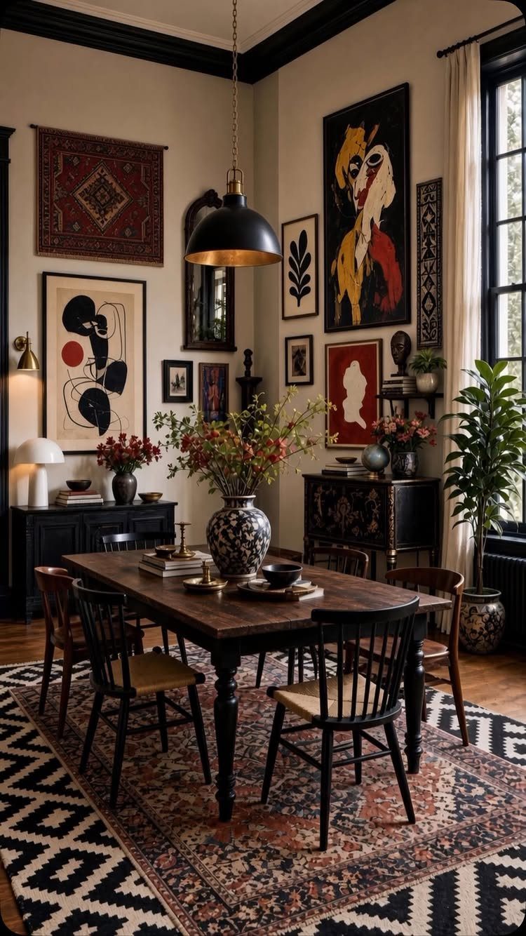
A gallery wall solves the dining room problem of one big awkward plane by breaking it into many small deliberate ones.
The frame color is what makes it read as single piece or chaos: keep that consistent and you can mix photos, prints, a small textile, anything. For a buffet wall, a 3×3 or 4×3 grid stays neat and formal.
Tall ceilings call for a vertical stack; boxy corners soften with an L-shape that leads the eye around.

DIMMER & TIMER & REMOTE: Homemory flameless taper candles have a built-in DIMMER, adjust the brightness at will, meet various decorative needs; 2/4/6/8 hours cycle TIMER set the time period for the candle to light every day. All these functions can be deployed through a small REMOTE CONTROL, convenient and facilitative.

10 Keys Remote and Automatic Timer: Homemory have customized the functions you need. (1). 2 light modes, flickering or normal light. (2). The 2-4-6-8 hours cycle timer function turns on at the same time every day. (3) Create the warmest lighting effect through simple lighting brightness adjustment.

【More Realistic Flame Effect】 After continuous experiments, our led flame effect lights will render as wobbly as a real flame, building a more live scene.
9. Wall Baskets
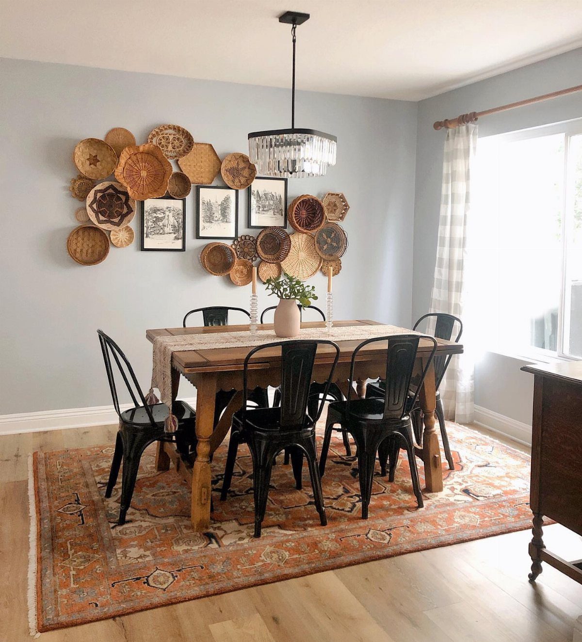
Flat-backed baskets hang flush like art but read softer, warmer, more tactile than anything in a frame. Woven texture does the work, so the wall color matters less; these show up against white, pale blue, even deeper tones.
The example mixes baskets with black and white prints, which keeps the wall from going too country. Narrow tobacco baskets hang like art on their own.
Decorative hooks add another layer of detail if the basket weave is simple.
Fill them with dried stems or nothing at all; greenery needs water and dirt, which defeats the point of wall-mounted. A basket with a flat back and a hook hangs fast, no level needed if you step back and nudge.
Best for renters who want impact without the patch-and-paint later.

【Wide Applications】: Our plate hangers for the wall are perfect for displaying your antique plates, art plates, vintage plates, or ceramic plates. These plate hangers are ideal for showcasing them on the wall. The plate hangers for the wall provide a secure display solution for your precious collection.

What You Will Get: You will receive 14 pieces of plate hangers for the wall in 5 sizes: 3 pcs of 4 inches, 6 inches, 8 inches,10 inches, and 2 pcs of 12 inches. The decorative plates for wall hanging also contains 14 pieces of hooks with nails and 16 sets of protective cover.Notice:Assembly Required Before Use

★Wall mountable or table top display stand. Ideal for 6" - 10" Items.
10. Display Cabinet
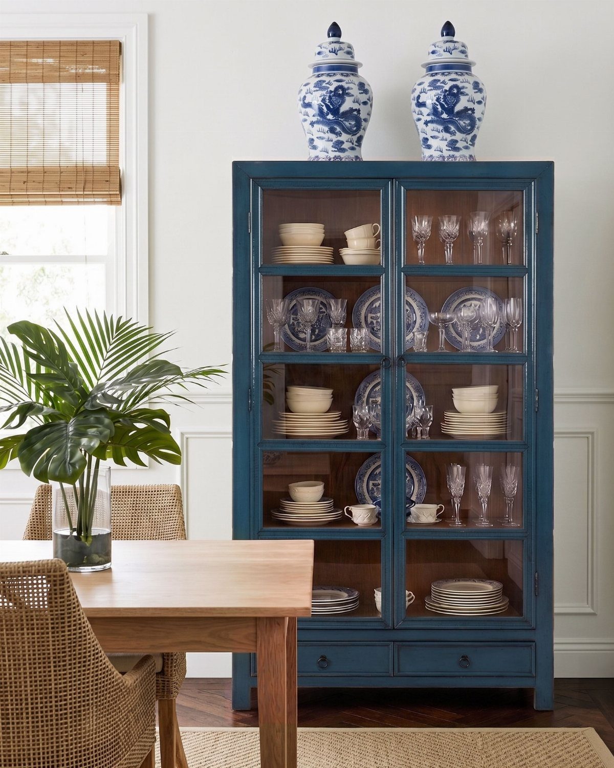
A tall glass-front cabinet already owns the wall space; the question is whether it looks like storage or like something intentional. The answer sits in what goes on the shelves.
Art books turned spine-out or stacked, one decorative object per shelf, a little breathing room between pieces.
The example runs white and blue china with two ginger jars on top, a color story that reads as collected over time rather than bought in a set.
Mix the heights, keep the palette tight, and the cabinet becomes the room’s artwork without hanging a thing.
This one trades away hidden storage for display. If you need to stash napkins and candles, add a lower solid door or a sideboard.

Vintage Wall Decor - The home wall decoration is a perfect blend of vintage charm and timeless elegance which making it an ideal addition to kitchen, dining rooms, farmhouse, living room, and more

EASY TO INSTALL: The Memories Around the Table sign kitchen wall decor dining room wall art is a lightweight piece making it easy as pie to hang! You will love the simplicity of how easy it was to go from taking out the box and hanging it on the wall. Screws are included in the package too. Or just simply sit it on your nightstand.

Quality Material: The frame made of premium-grade solid wood, middle part is made of a solid thick fiberboard, size is 40'' 15'' 1''
11. Built-in Shelving Units
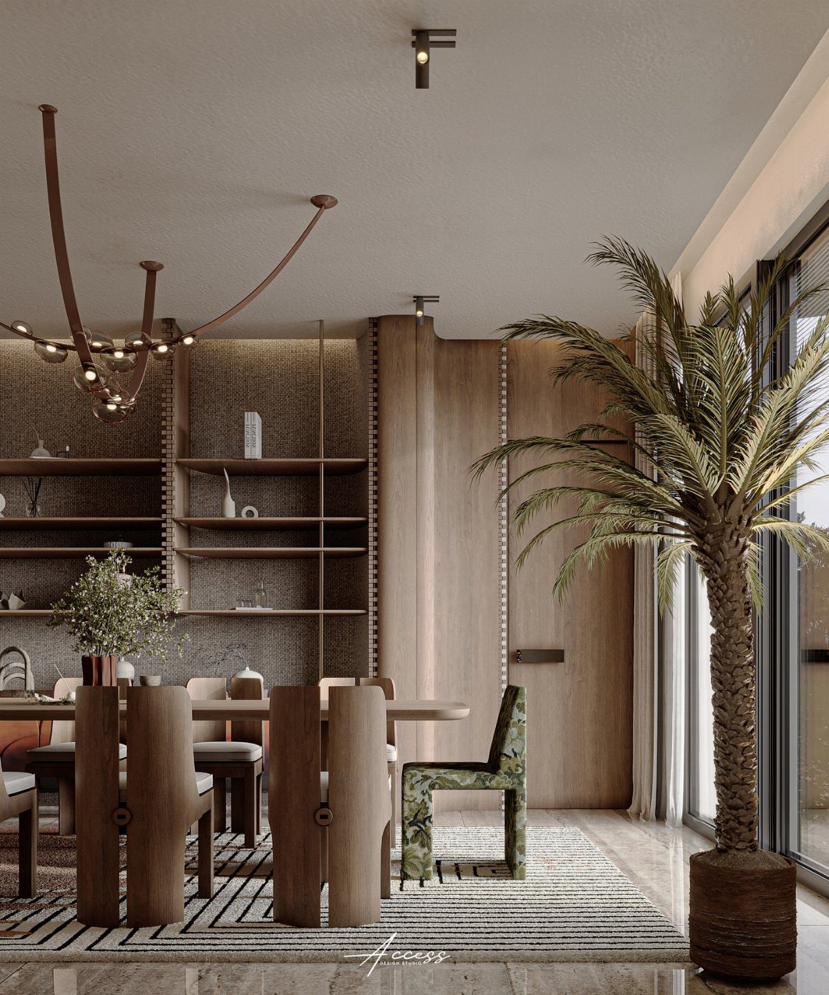
Built-ins give a dining room the borrowed warmth of a library without the books needing to be real. The example runs wood shelving against a textured wall, styled with plants, objects, maybe a lamp.
The shelving itself is the architecture; what sits on it changes with the season or the meal. Wood tone matters more than style: match the table for cohesion, contrast it for interest.
A tall palm or trailing plant breaks the horizontal lines.
These need a wall you can build into or against. Freestanding units in the same spirit work for renters, though they read heavier.
The maker mentioned candles, ornaments, framed artwork; any of those rotate in as the mood shifts.
12. Farmhouse Word Sign Wall
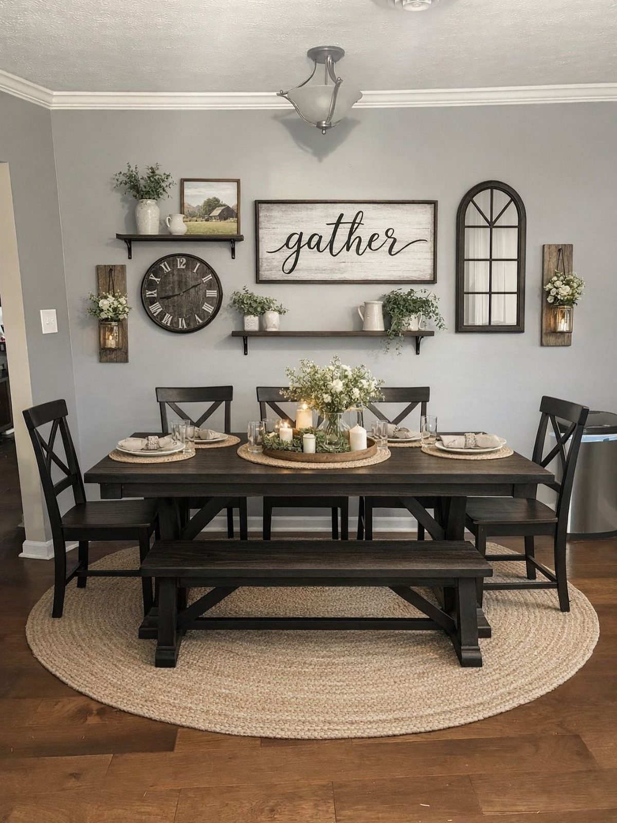
A word sign tells everyone what the room is for, which only works if you want that spelled out.
"Gather" on a grey wall with an arched window frame and a big round clock gives the room a program: come in, sit down, stay. The pieces around it keep it from feeling like a craft-store sign hung alone.
The example layers floating shelves with small florals, an arched frame, a clock, so the word is one element in a larger story, not the whole statement.
This suits someone who hosts regularly and wants the room to feel welcoming before anyone sits. It trades away subtlety for warmth; a minimalist or formal dining room needs a different move entirely.
13. Floating Shelves
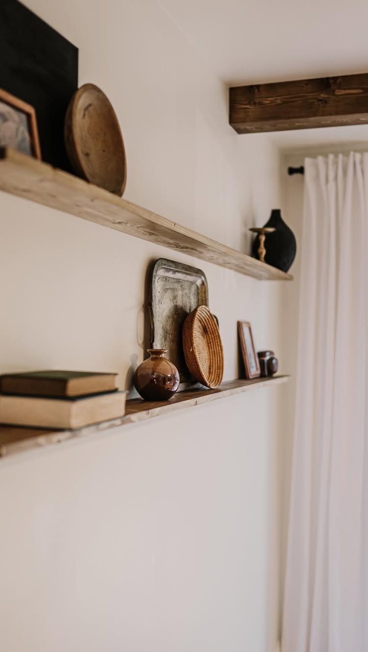
Floating shelves give you somewhere to put things without giving up floor space. Two pine boards from the hardware store, properly anchored, hold more than you’d think: small frames, a couple of bowls, a stack of cookbooks you actually open.
A hidden bracket carries the whole look. Hidden hardware costs more than visible L-brackets but reads cleaner against the wall.
I like stained wood against off-white paint; painted shelves the same color as the wall disappear in a way that feels intentional, not cheap.
Style them with odd numbers, varied heights, and one thing that isn’t decorative. A woven basket holding napkins breaks up the prettiness.
Best for: renters who can patch a few holes later, or anyone whose dining room doubles as a desk.
14. Vintage Plates
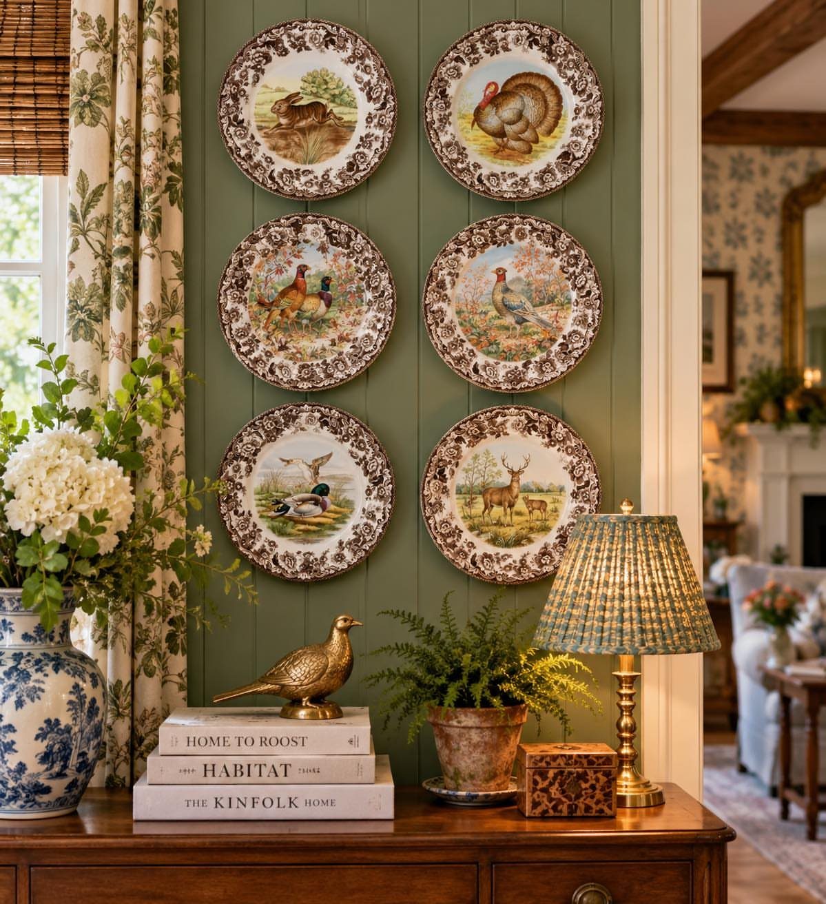
Six plates on a green wall sounds like a grandmother’s house until you see it done with illustrated wildlife and a dark console beneath.
The spacing matters more than the plates: 2 inches between edges, not centers, keeps the grid from drifting.
Thrift stores turn up single plates for pocket change. I look for color families, not matching sets; three blues and three creams read as collection, not accident.
Plate hangers with spring wire grip better than the adhesive kind, which fail in humidity and take finish with them.
Hang them at standing eye level, not seated; the temptation is to center on the table but guests see them from the doorway.
Best for: someone who already owns 2 plates they love and needs a reason to hunt for 4 more.
Choosing the Right Size
Art or a grouping should run 60-80% of your table width. A 60-inch table wants a 36-48 inch piece; 72 inches calls for 43-58.
Paper cutouts on the wall beat regret.
Center the middle of the piece 57-60 inches from the floor. With ceilings over 9 feet, you can nudge things up a few inches.
Grid spacing stays tight: 1.5-2 inches for smaller groupings, 2-3 inches for larger. Frames hung close together read as a single statement to the eye.
Creating a Cohesive Look
Pick 2-3 colors or materials and run them through the room. Black frames pick up black chair legs without trying too hard.
Brass sconces pick up brass flatware. The echo does the tying-together work.
A bold wall needs the same discipline. Cobalt paintings and cobalt upholstery share one hue; the room reads intentional, not loud.
The finishes matter as much as the colors. Wood, metal, fabric: repeat at least one across three places and the mix stops feeling accidental.
Lighting Considerations
Warm bulbs run 2700-3000 Kelvin. That range flatters food and faces both; cooler light reads clinical at a dinner table.
Sconces flanking a mirror or a central piece give you layers to dim. The overhead chandelier alone flattens everything.
Add wall-mounted light and candlelight, and the room gains depth as the evening goes.
A mirror used as the focal point needs enough scale to own the wall. Place the mirror where it catches window light or bounces the chandelier back into the room.
Renter-friendly Options
Peel-and-stick wallpaper and molding kits fake architecture without risking your deposit. Adhesive frames go up without nails and shift until spacing is right.
Cordless, rechargeable sconces give the glow of hardwired fixtures without the electrical box or the deposit risk.
For color without paint, removable panels or a peel-and-stick mural behind a gallery does the work.
Test any adhesive product on your actual wall first. Smooth painted drywall and wood hold fine; heavily textured stucco does not.
Frequently Asked Questions
What to put on the walls of a dining room?
Framed art, mirrors, wallpaper, sconces, plates, baskets, or floating shelves all work. The move that fits depends on your wall size, light, and whether you rent or own.
A single large mirror or a tight grid of prints over the table is the safest starting point.
Is a gallery wall still a good idea for a dining room?
A gallery wall still works, particularly when you’re staring at one big blank surface that needs dividing into something human-scale.
Match your frames in color or finish and keep the gaps even so the whole grid reads as a single intentional shape instead of visual noise.
Line the center of the gallery up with your chandelier or the piece below it so the wall doesn’t float off on its own.