An accent wall is a single treated surface meant to anchor a room’s attention.
The 2026 direction makes it work harder by demanding texture and weight rather than bold color alone, which matters when you are renting and cannot touch cabinets or flooring you do not own.
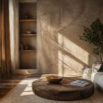
Limewash, a limestone-and-water finish that dries matte and suede-like, is the technique gaining traction; Leanne Ford uses it specifically for the warmth it adds, and a single wall of it costs less than replacing built-ins you cannot keep.
1. Warm and Cozy Elements
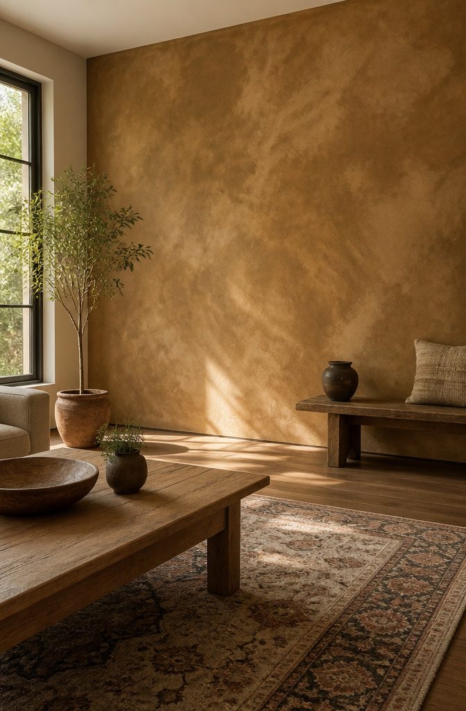
Warmth in a room used to come from built-ins and flooring you couldn’t afford to change. The 2026 accent wall trend flips that: texture and weight do the work instead of color alone.
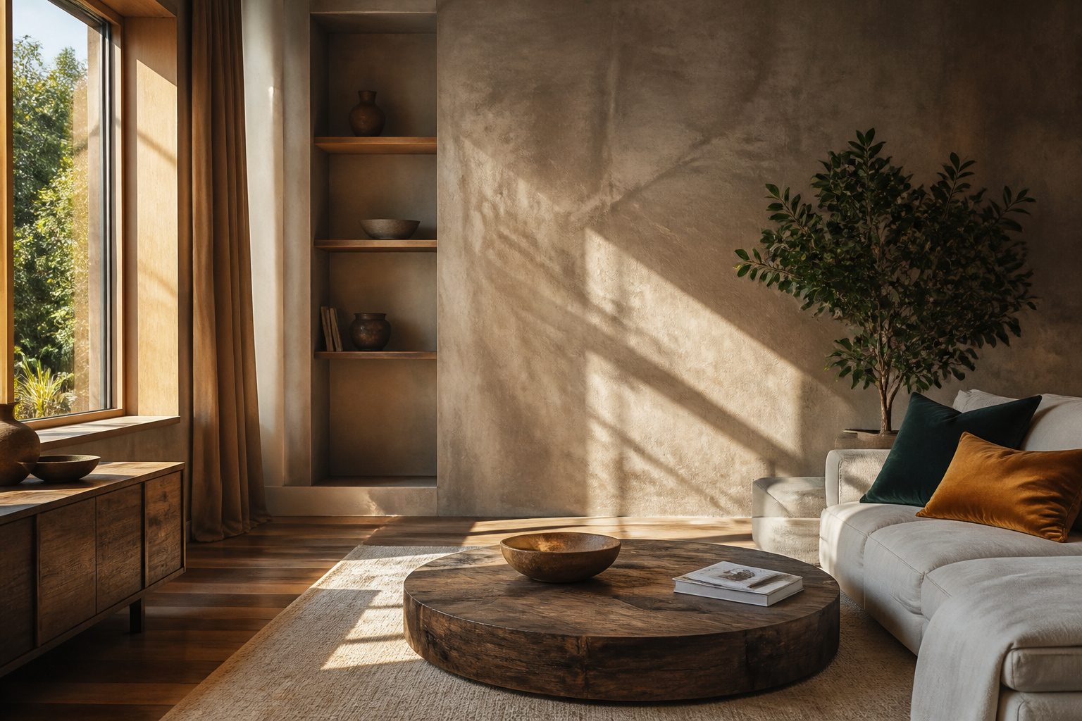
Limewash is the technique worth knowing here. It goes on translucent with a chalky, paste-like consistency and dries to a matte, suede-like finish that reads as aged rather than flat.
Interior designer Leanne Ford has used it specifically for the warmth it adds, and for renters it solves a real problem.
One wall of limewash gives you the grounded feeling of natural material without touching cabinets or floors you don’t own.
Color temperature matters as much as texture. Palette directions are leaning into Rich Gold, Apricot Brandy, and Mocha Mousse, tones that pull yellow and brown rather than gray.
These read as warm under both daylight and evening lamplight, which matters when you’re working with standard rental lighting you can’t swap out.
Jean Stoffer’s approach to the technique covers another rental-friendly angle: existing drywall can serve as the base if your walls are smooth, so you’re not layering on heavy board or risking your deposit with built-ins.
The limewash finish catches light unevenly, which hides wall imperfections that flat paint would advertise. In a space with cheap flooring and contractor-grade cabinets, that irregularity becomes the feature that makes everything else look intentional.

Extra-Long 9-Inch Brush for Faster Coverage – Designed longer than standard limewash brushes, this 9-inch wide brush covers more surface area with every stroke, helping you finish limewash and mineral paint projects faster and more evenly.

Meoded Lime Wash is a unique slaked limestone mineral coating that creates a beautiful weathered plaster-like finish on almost any interior and exterior surface.

Meoded Lime Wash is a unique slaked limestone mineral coating that creates a beautiful weathered plaster-like finish on almost any interior and exterior surface.
2. Wellness and Self-Care Themes
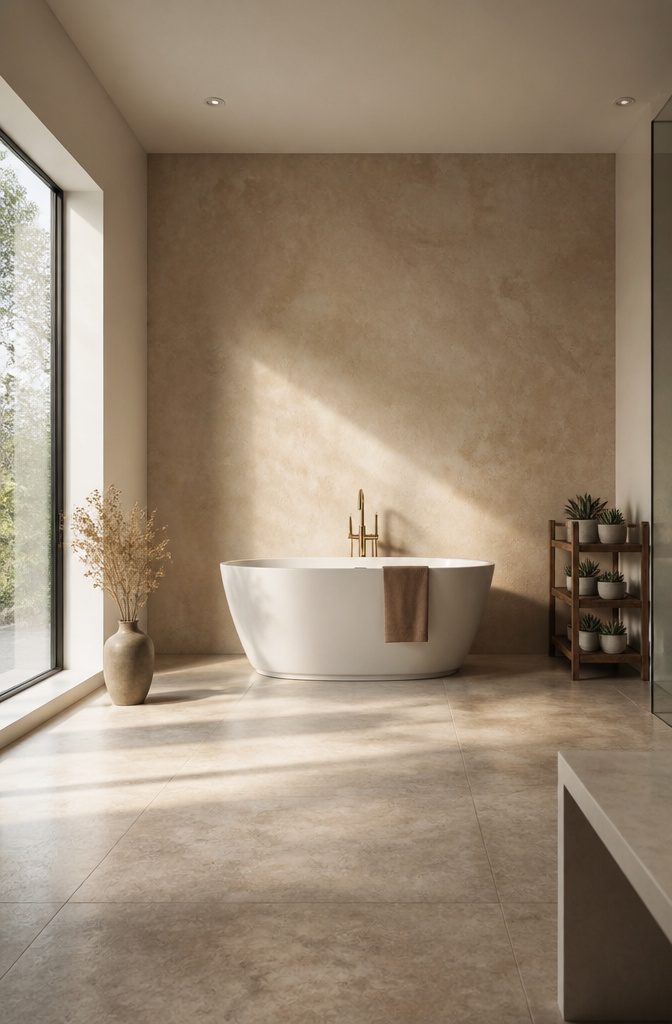
The wall behind your morning stretch or evening bath now carries as much weight as the tile or fixtures. An accent wall in 2026 works harder when it frames a routine, not just a room.
A flat color behind a reading chair reads flat after twenty minutes; a hand-applied plaster finish or a muted stripe gives the eye something to settle into while your shoulders drop.
I learned this redoing my own bath corner last spring. The paint I chose looked calm in the can but turned clinical under the vanity light at 6 a.m.
Swapping to a warm, imperfect surface, something with actual texture, made the space feel held rather than staged. It cost maybe forty dollars more than the single-coat shortcut and an extra Saturday.
For a yoga corner, the mistake is going too dark or too busy.
Movement needs a backdrop that quiets, not competes. A wash in a single muted tone, matte enough to catch soft morning light without glare, does more than a feature color that photographs well and lives badly.
The same rule holds for any wall you face while unwinding: if you notice it first, it is failing.

REAL PLASTER AND FABRIC TEXTURE: This set of 2 features raised plaster surfaces combined with real fabric arranged into flowing folds. Unlike flat printed artwork, the sculptural texture creates visible depth, soft shadows and a tactile dimensional appearance that changes subtly with the room lighting

Taupe dimensional peel and stick wallpaper made to look and feel like textured wall plaster

Versatile Surface Application: Suitable for creating professional textured finishes on walls, ceilings, furniture, and more. This stencil works flawlessly on flat and slightly curved surfaces, including drywall, wood, concrete, and canvas, making it ideal for DIY home renovations, accent walls, and artistic projects
3. Light and Warm Colors
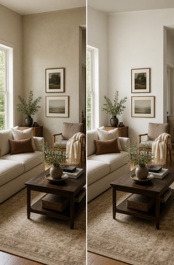
Pantone’s 2026 Color of the Year, Cloud Dancer, lands at a moment when pale warm tones are replacing the high-drama accent walls that dominated the last few years.
This is a lighter white meant to calm a room rather than command it, and that shift matters if you are working with an apartment or an older home where the windows are small or face north.
Cloud Dancer reads as warm without yellowing, which is the balance that keeps a limited-light room from feeling like a rental beige box.
Pair it with Mocha Mousse, Pantone’s 2025 carryover, and the wall gains depth without contrast sharp enough to shrink the space. Powdered pastels work the same way; they let the pale tone do the accent work instead of fighting it.
The move here is restraint.
A full coffee-tone palette, from cream through mahogany, can run the whole room and still feel like one gesture. That saves the weekend timeline and the budget, since you are buying one paint family and stopping.

Voted America’s Favorite Crafting Glue by generations of crafters, hobbyists, and households

SUPERIOR SCRATCH RESISTANCE: This urethane-based clear coat offers exceptional protection against scratches and scuffs, ensuring your leather items remain pristine.

Professional Matte Leather Protection: Forms a transparent protective matte film on leather surfaces to resist daily wear, oxidation, and fading, effectively extending the service life of leather goods like sneakers, shoes, bags, and jackets.
4. Blue Hues
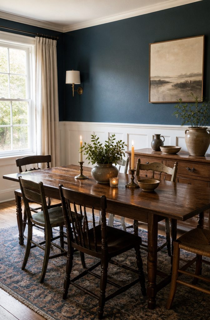
Mallard Blue is the specific shade sources keep naming for 2026 accent walls, a deep teal-leaning blue that reads as grounded rather than airy. The mistake most people make is treating all blues as universally calming.
In a north-facing room, cool blues pull gray and feel institutional fast. Warm the undertone or shift toward a green-blue like Mallard itself, and the wall holds the room instead of floating away from it.
I learned this the hard way in a rental with one window and a northern exposure.
The first blue I tried, a clean cobalt, looked like a dentist’s office by 3 p.m. The second sample, greener and deeper, finally did what I wanted: it receded enough to feel designed, not accidental.
Blue’s persistence in trend lists is partly this flexibility. Pantone’s Classic Blue in 2020, the periwinkle Very Peri in 2022, and now Mallard Blue for 2026 show the same family shape-shifting every few years.
For a weekend project with a gallon or two of paint, that longevity matters. You are not chasing a one-season color; you are plugging into a thread that keeps renewing itself.
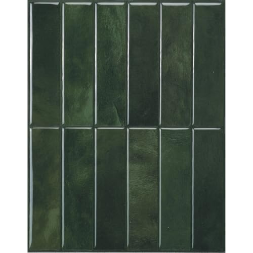
Effortless installation, premium design – a smarter way to renovate. Smart Tiles are pioneers in self adhesive wall tiles, proudly made in Canada. Thanks to our patented adhesive, installation is fast and clean—no tools, glue or mess. Just peel and stick. Unlike low-grade sticky tiles or self adhesive vinyl, our high-quality stick on tiles won’t yellow, peel or crack over time. Perfect for upgrading your kitchen splashback, refreshing a bathroom, or creating modern wall panels —even in moisture-prone areas (not for direct water contact).

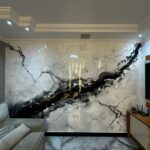
47.2 x 118 in roll covers about 38.6 sq ft peel and stick carrara white marble wallpaper foam wall panels for DIY renter friendly accent wall TV wall bedroom coffee shop decor

DIY Your Accent Wall - With 3D raised pattern and sleek, modern design, these panels effortlessly enhance various interior styles, transforming ordinary walls into captivating accent walls, a simple DIY solution for both residential and commercial interiors
5. Natural Elements
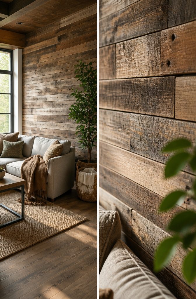
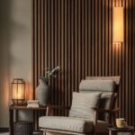
Wood brings warmth that paint rarely matches, and the 2026 direction pushes further into materials that carry real grain and weight.
Reclaimed boards or plywood sheets cut to an asymmetric pattern can run under $300 for a ten-foot wall, though sourcing enough matching reclaimed stock takes longer than a single Saturday.
Stone veneer panels have slimmed down; the newer polyurethane-backed versions weigh a fraction of traditional stack stone and install with construction adhesive, but the good ones still sit around $800–$900 for that same wall once you factor in corner pieces.
Cork arrived as a quiet surprise in the trend forecasts.
Sheets of natural cork, either left raw or finished with a matte sealant, read as texture rather than color and deaden sound in a way that matters in open plans or bedrooms shared with thin walls.
The material runs roughly $4–$6 per square foot, so a feature wall lands well inside a thousand if you skip the labor. Bioplastic cladding made from agricultural waste is genuinely next, molded into tile patterns that mimic bark or woven reed.
It is not widely stocked yet, so a weekend timeline is unlikely unless you live near a distributor. For renters, cork and plywood both come down with minimal patching.
Stone veneer, even the lightweight kind, leaves marks that require real repair at move-out. My own leaning, after weighing the options, is toward cork for bedrooms and plywood for living spaces where you want the statement without the structural load.
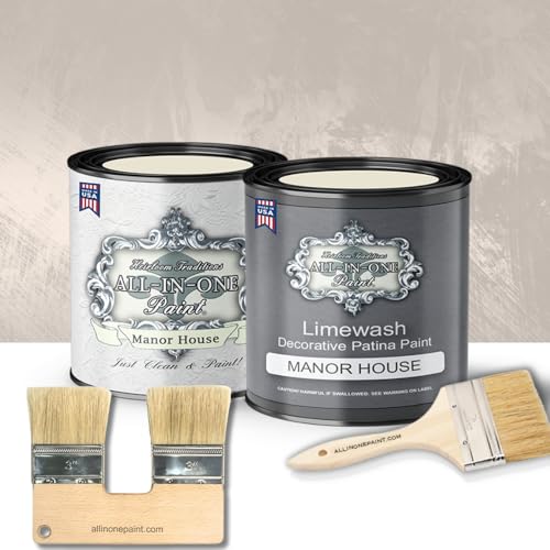
SURFACE PREP: Wipe down to remove dust & debris. In heavy use areas, such as kitchens/bath/etc clean well with ALL-IN-ONE Paint surface prep to remove surfaces oils/grease.

Meoded Lime Wash is a unique slaked limestone mineral coating that creates a beautiful weathered plaster-like finish on almost any interior and exterior surface.
6. Biophilic Design
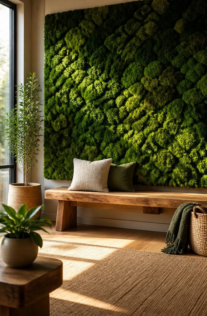
Biophilic design sounds like a buzzword until you try to relax in a room with a preserved moss panel behind the sofa.
The difference between this and simply hanging a botanical print is the wall itself becomes the living system, or at least a convincing stand-in for one.
Living walls need irrigation, drainage, and enough light to keep plants alive, which turns a weekend project into a plumbing conversation. Preserved moss panels skip the water entirely, though they will fade and shed in direct sun or high humidity.
For renters, framed moss tiles or peel-and-stick panels that reference leaf patterns or bark texture give the same stress-reduction effect without the commitment. Expect to dust preserved moss gently with a soft brush; vacuuming shreds it.
If the wall sits where morning light already hits, a living system might work, but most first homes are better served by the low-maintenance version that still reads as organic rather than decorative.

𝐌𝐞𝐭𝐚𝐥𝐥𝐢𝐜 𝐖𝐚𝐥𝐥𝐩𝐚𝐩𝐞𝐫: This metallic peel and stick wallpaper features a distressed plaster design with rich teal green background with subtle metallic gold accents, creating a modern, industrial-chic look to any space. Roll size is 15.7 inches wide by 118 inches long, covers 13 square feet

𝐓𝐎𝐏 𝐓𝐈𝐏𝐒: It's best to do the installation with two people for this wide size concrete wallpaper, easier and smoother!

𝐁𝐞𝐢𝐠𝐞 𝐋𝐢𝐦𝐞 𝐖𝐚𝐬𝐡 𝐀𝐞𝐬𝐭𝐡𝐞𝐭𝐢𝐜: This concrete wallpaper features a natural lime wash look in soft cream beige color, embossed texture adds tactile dimention to your walls that feel as good as it look, perfect for creating a Japandi or warm industrial atmosphere
7. Sustainable Materials
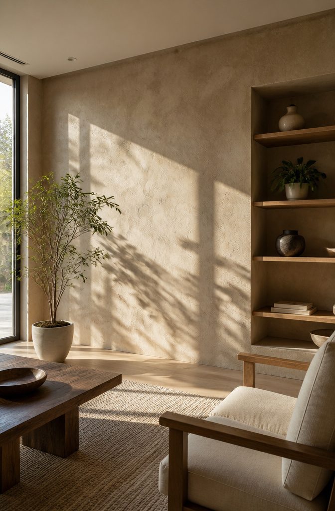
Limewash, made from limestone mixed with water, gives walls a matte suede-like finish that catches evening light differently than flat paint.
The warmth interior designer Jean Stoffer described, that glow against art and furnishings, comes from the material itself rather than added pigment.
The sustainability claims hold up on composition.
No chemical base means no VOC off-gassing, and the breathability can matter in bedrooms where air quality affects sleep. But the word "sustainable" gets stretched at big-box price points.
A $45 gallon labeled eco-friendly may contain the same limestone and water as a $180 specialty tin, or it may carry enough synthetic binder to defeat the point. Check the ingredient list for water and limestone first, additives second.
Other low-impact options worth considering: unpainted plaster left raw, or clay-based paints with similar mineral content.
These run comparable to mid-tier latex, not premium designer lines, and they age visibly. That patina is the feature, not a flaw to touch up.

Professional Leather Protection: Forms a transparent protective matte film on leather surfaces to resist daily wear, oxidation, and fading, effectively extending the service life of leather goods like sneakers, shoes, bags, and jackets.

SPRAY MATTE FINISH 11OZ
8. Multifunctional and Convertible Furniture
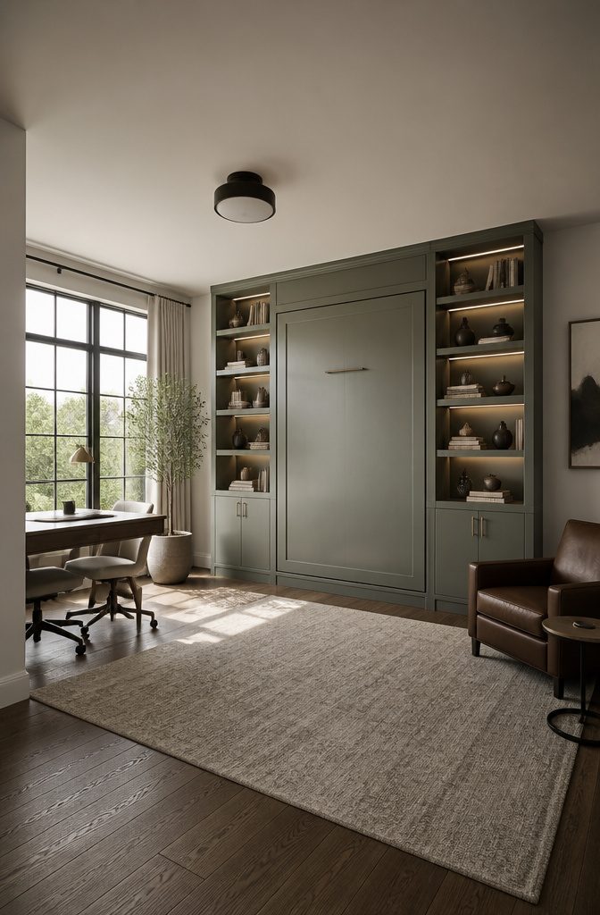
Murphy beds and folding desks are changing what an accent wall has to handle.
The wall behind a bed that folds up becomes a different surface by morning: it needs hardware that can take the weight, plus lighting that works whether the bed is down or stowed.
I have seen installations where the sconce placement was planned only for the bed-down position, and the room looked half-lit once the bed was stored.
Room dividers that mount to or sit against the wall add another layer. A folding partition on a track needs structural backing where the track lands, and the accent finish has to survive the hardware rubbing against it.
Paint alone chips; a thin wood panel or a laminate strip at the contact points lasts longer.
The boldest move is treating the wall itself as the furniture. A desk that folds out from a paneled wall, or shelves that pivot into a room divider, means the accent color or texture becomes the working surface.
That surface has to be cleanable and hard-wearing, not just pretty in a photo. Gloss levels matter here: eggshell or satin wipes down; flat paint shows every scuff from a chair back or a laptop edge.
For renters, the hardware question is the dealbreaker. Toggle bolts through a bold color wall leave holes that are visible immediately, so the mounting plan and the paint touch-up kit need to be ready before the first hole goes in.

PREMIUM PEEL AND STICK TILES MADE IN NORTH AMERICA : Buy local from the market leader in self-adhesive wall tiles. At Smart Tiles, we offer a large selection of easy to install, high quality backsplash tile designs.

Warm Tips: Colors may vary slightly due to different lighting conditions and screen settings. We recommend purchasing enough rolls at once to ensure they come from the same batch for a consistent color match. Apply to a clean, dry, and smooth surface for the best adhesion

UNIQUE DESIGN:This floating shelf wall is made of high-quality materials,equipped with hemp rope,decorative leaves,and light strips,which can be paired with any rural,Bohemian,modern or minimalist home decoration.
9. Seamless and Discreet Technology
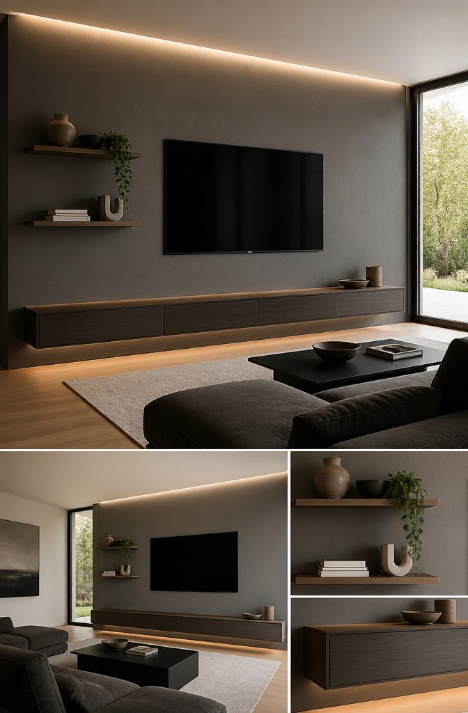
A flatscreen mounted on a feature wall dies the minute cables snake down to the baseboard.
Recessed electrical boxes set into the stud bay before you paint let the TV sit nearly flush, and the cord gap disappears behind the bezel.
Speakers follow the same logic: in-wall or on-wall units wired through the cavity keep the surface clean, though retrofitting means cutting drywall you just finished.
Renters need to think about what happens at move-out. Cord channels that paint over flat, low-voltage cable runs peel away later without tearing paper facing.
Magnetic puck lights or adhesive LED strips leave zero holes, while recessed can lights and hardwired sconces stay behind as landlord property or require a patch.
The same goes for floating shelves with built-in charging: a bracket lagged into a stud leaves a quarter-inch hole that spackle fixes in ten minutes, but routing USB through the wall means a gang box that needs a blank plate when you leave.
My take is to keep the technology layer removable. Paint the wall first, then add the hardware, so a future touch-up only has to match one coat, not a whole system.

HIGH GRADE NYLON BRISTLES: This 5" block paint brush is made of premium soft curved nylon bristles, which can get in all areas for an evenly paint distribution. The wavy synthetic filaments allow a great capacity of holding paints, work efficiently and smoothly with precise control while doing painting jobs. No hair loss, resulting in a high-quality finish on walls and other surfaces. The bristle is easy to clean and maintain its shape after washing, get ready for next use

The 5-inch deck brush features soft blended synthetic filaments, the household bristle paint brush covers large areas rapidly for deck stain application, greatly improving your staining efficiency

Premium-quality, water-based, 100% acrylic primer formulated to be used as a base coat for Meoded Lime Wash
10. Statement Pieces
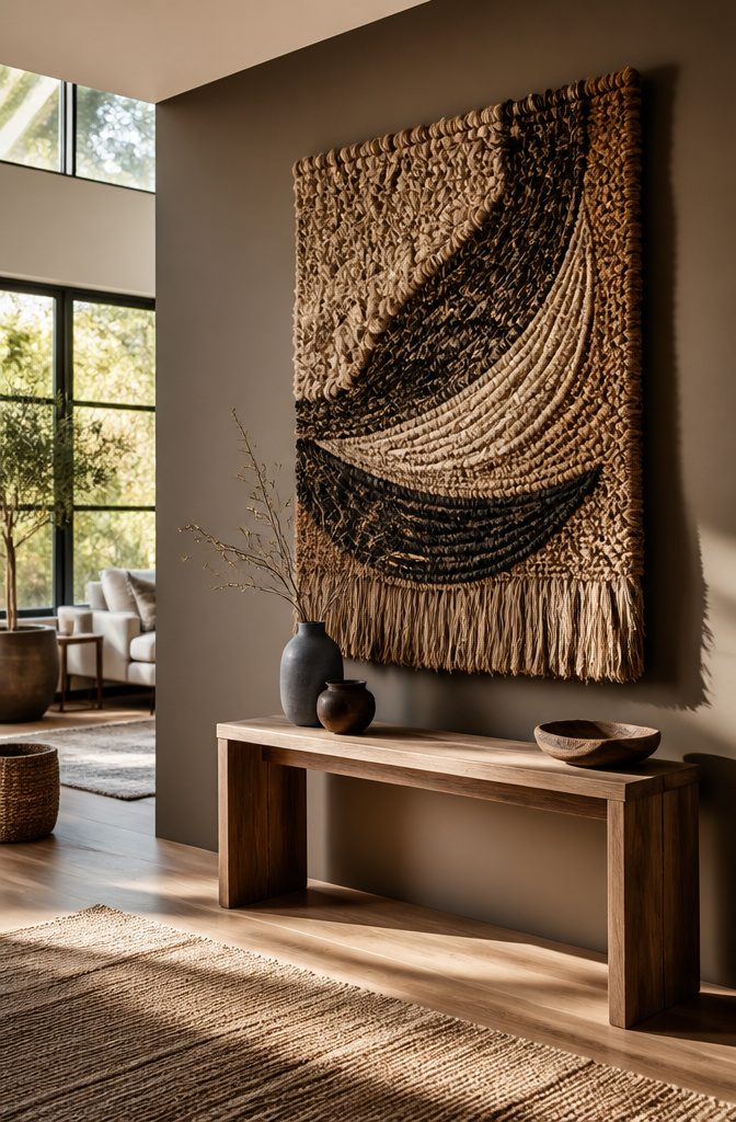
A single oversized piece can carry a whole wall without a drop of paint or a single nail in the landlord’s drywall.
Last spring I helped a friend hang a four-foot woven wall sculpture in her rental living room, and the room felt finished in twenty minutes.
Oversized patterns on that art, though, need restraint. A geometric print at scale fights the sofa, the rug, the curtains all at once, and the eye has nowhere to rest.
Sculptural shelving works the same way: one asymmetric metal unit with a few books and a trailing pothos reads as intentional, while the same shelf crammed edge-to-edge loses the shape that made it interesting.
The budget here is the real draw. A single statement object, even a secondhand find, runs under a hundred dollars and travels with you.
Stone, lightweight metal, fabric, or mixed media all play, and the piece can be subtle, like embroidery that lifts slightly off the canvas, or bold enough to stop conversation.
The mistake is treating the object as wallpaper: if the pattern or texture shouts louder than the room’s own proportions, the wall shrinks and the whole space feels off.

Concrete Peel and Stick Wallpaper: long lasting hold on smooth clean dry surfaces creates a soft greige wall paper peel and stick finish, ideal for larger rental walls, kitchen updates and modern living rooms

Real Raised Plaster Texture Sculpted white petals and textured green leaves create visible depth and natural shadow, offering a dimensional alternative to ordinary flat printed wall art.
11. Limewash
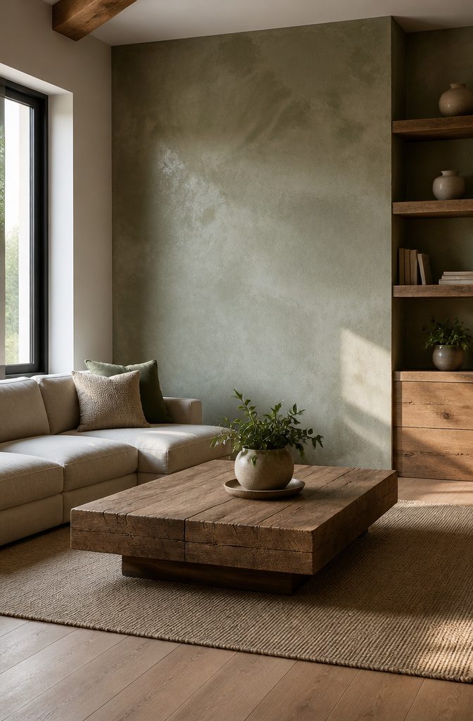
Limewash is limestone and water, nothing else, and that simplicity is what gives it the matte, suede-like finish people keep touching.
The wall has to be porous for it to bite, so bare drywall or previously unpainted plaster works best. Painted surfaces need sanding or a specialty primer first, or the limewash sits on top and powders off.
Where it fails is bathrooms and kitchens. The moisture lifts the finish in patches that look like water stains on raw stone, not the charming kind.
Touch-up after a year means reworking the whole section, not dabbing at a spot, because the new coat sits brighter against the aged one.
The aging itself is the point: the finish softens and mottles, turning slightly warmer as airborne dust settles into the pores.
Some people hate that progression. Others plan for it and leave a corner untouched just to watch the shift.
Application is fast, a few hours across a single wall, but the learning curve is real. The first pass looks terrifyingly thin and streaky.
The second pass, worked in with a block brush in crossed strokes, is where the depth builds. Rushing the overlap leaves lap marks that no amount of feathering erases.
12. Dark Accent Walls
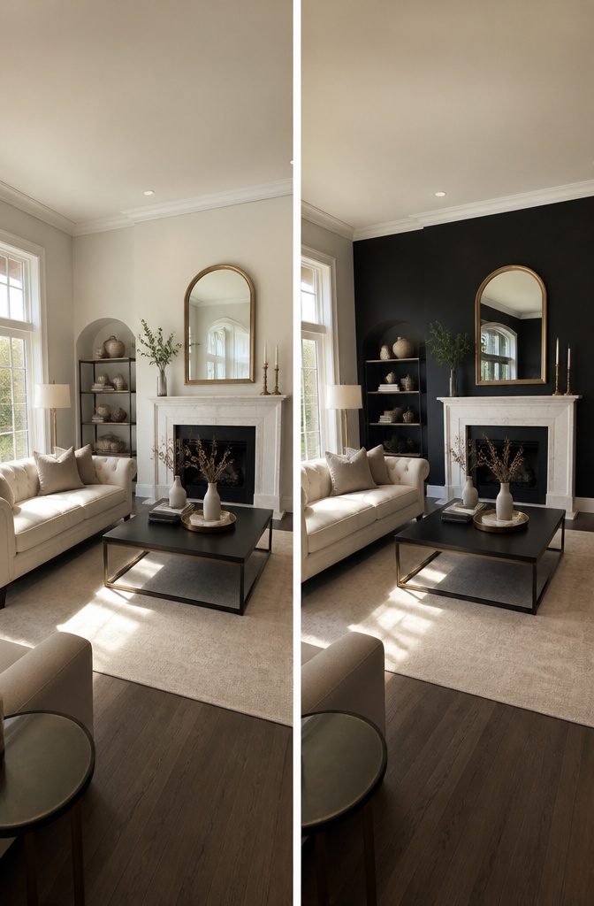
Caviar Black reads almost brown in afternoon light, which is why it works better than pure black for walls that have to live with you.
The wall you paint should be the first one visible when you walk into the room, a rule that dark colors complicate rather than cancel.
In my experience, confirming the rule by painting that entry wall blackish can make a small room feel like a deliberate cocoon, not a mistake.
Breaking it by choosing a side wall instead lets the dark recede behind furniture, which is the safer move for a first project on a Saturday budget.
Rooms with decent natural light handle Caviar Black without turning cave-like; north-facing bedrooms need the compensation of lighter upholstery and bedding to bounce light back.
Metallic accents help too, a trick I picked up after seeing how brushed brass handles caught what little window light there was.
One wall is usually enough. The vampire cave look requires four, and most renters do not have the square footage or the security deposit to spare for that experiment.
Wall Selection and First Sight
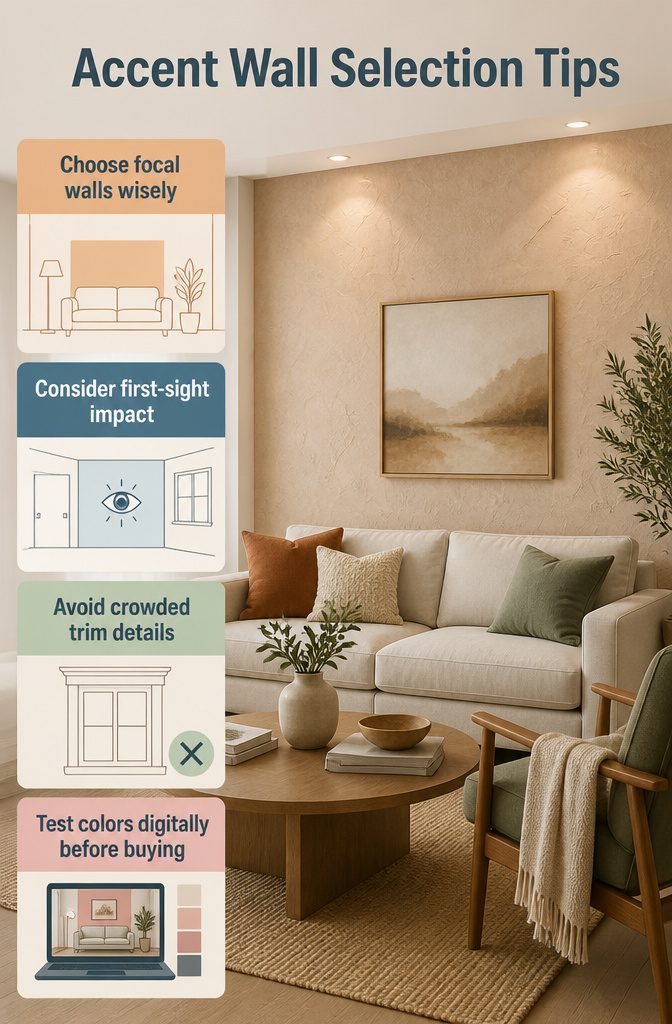
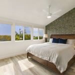
The wall behind your headboard or couch is usually the safest bet for an accent wall 2026, since those spots already draw the eye without extra help.
But the first-sight rule wins when you’re unsure: walk into the room and notice which surface your gaze hits before anything else.
That wall carries the most visual weight already, so giving it color or texture feels intentional rather than random.
Doors and windows break up the impact, so a wall crowded with trim rarely pays off for the treatment. The exception is a dining room, where wrapping all four walls in something bold can work better than isolating one.
In bedrooms, the headboard wall stays the default for a reason; in living rooms, the surface behind either the sofa or the entertainment unit usually reads as the natural focal point.
Before buying paint or panels, test the design digitally. Room visualizer tools let you drop in colors or textures against your actual layout, which saves the weekend you would have spent repainting a mistake.
Start with a clear plan that accounts for how the room functions and where natural light falls at different hours.
A wall that looks dramatic at ten in the morning can turn flat by dinner if the sun never reaches it.
Proportion and Panel Spacing
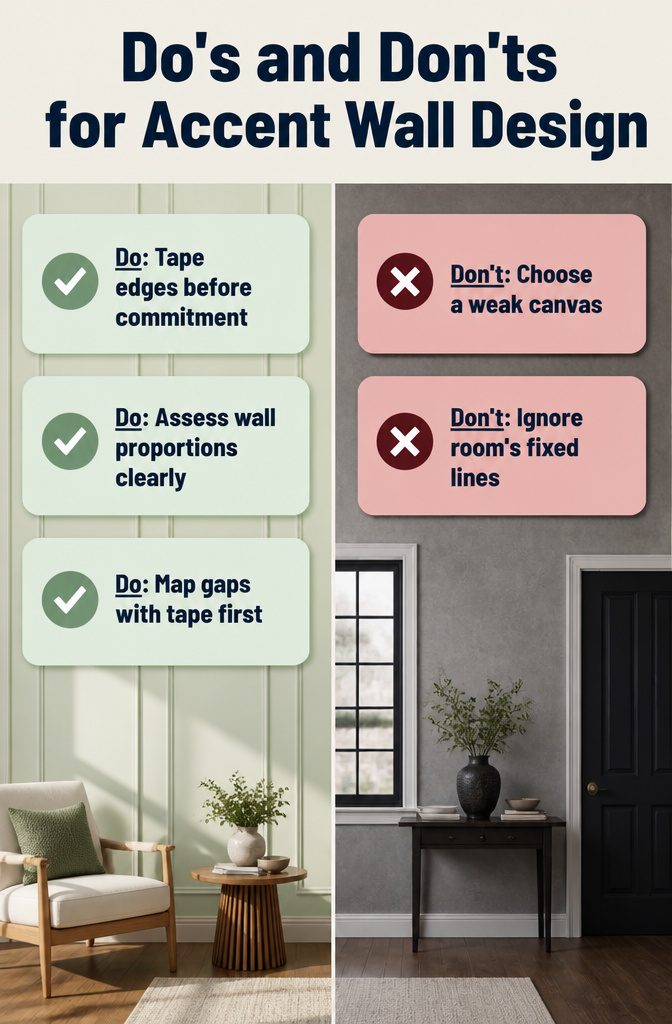
Most accent wall 2026 projects that go wrong started with the wall itself being the wrong canvas. A narrow strip between two doors, or a wall chopped up by windows, fights whatever you put on it.
Poor wall proportions are the first failure point: a panel treatment or bold color on a wall that is too short, too broken, or visually weak just looks like a mistake you are trying to hide.
The fix is to step back and read the wall as empty space before you commit. Tape off the floor at the proposed panel edges and live with it for a day.
The eye needs distance to catch what feels cramped. If the taped sections look squeezed, they are squeezed.
Panel spacing fails the same way. Gaps that read as accidental, or rails that sit too close to a ceiling line, break the rhythm you built the whole thing to create.
Map every gap with tape first, not after the first board is up. For beginners especially, this dry run is the difference between intentional and apologetic.
What reads as off before a single nail goes in? Boards that float with no relationship to the room’s fixed lines: door frames, the ceiling edge, the floor.
A panel that starts nowhere and ends nowhere looks hung, not built. The spacing should feel like it belongs to the architecture, not pasted on top of it.
Texture and Pattern Techniques
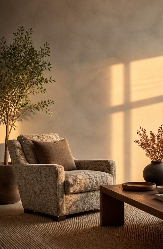
Texture on an accent wall lives a double life. Under daylight, a limewash finish shows every brushstroke and the chalky, suede-like surface catches shadows you would not see on flat paint.
After sunset, that same wall softens into something warmer and quieter, the ridges flattening under lamplight until the room feels smaller and more contained.
I learned to test samples at both hours after a plaster experiment in my last rental read as "rustic" at noon and "unfinished" by dinner.
The same shift hits patterned walls. Oversized patterns swallow a room’s focal point instead of creating one; the eye bounces around without landing anywhere, and the wall becomes noise rather than direction.
A geometric print I tried in a bedroom once fought the bed for attention and lost us both. Weak focal points and oversized patterns are two of the most common mistakes, and they often arrive together.
For renters, removable textured panels or peel-and-stick wallpaper in a small repeat solve the commitment problem.
Limewash, though, is the real thing: limestone crushed, burned, mixed with water, applied with a brush. It is not paint; it is thinner, more translucent, and it ages in place.
Leanne Ford uses it to bring outdoor warmth inside, and the matte, weathered result works especially well on the single wall that first meets your eye when you enter a room.
That first-sight rule matters more than which texture you choose.
Frequently Asked Questions
How do I choose the right wall for an accent design?
Pick the wall your eyes hit first when you walk into the room.
That wall already carries the most visual weight, so giving it color or texture feels intentional rather than random. Avoid walls broken up by doors and windows, since trim chops the impact.
How can I prevent design choices from reducing my room’s impact?
Start with a clear plan that accounts for how the room functions and where natural light falls at different hours.
Test colors or textures digitally with a room visualizer before you buy anything. A wall that looks dramatic at 10 a.m. can turn flat by dinner if the sun never reaches it.
Are accent walls out of style in 2026?
No.
Twelve distinct accent wall directions are shaping interior design in 2026, from limewash and warm palettes to cork panels and preserved moss. The shift is toward quieter, warmer treatments rather than the high-drama feature walls of recent years.
What are the trends in wall decor for 2026?
Warm and cozy elements like limewash, wellness-oriented textures, pale warm tones led by Pantone’s Cloud Dancer, deep teals such as Mallard Blue, natural materials including cork and reclaimed wood, biophilic moss panels, sustainable mineral finishes, and walls built to handle convertible furniture and hidden tech.
What is replacing accent walls?
Nothing is replacing them outright. The 2026 direction refines the idea: texture and material weight do the work instead of bold color alone, and walls now frame daily routines like morning stretches or evening reading rather than simply adding visual punch.
What is the rule for accent walls?
The first-sight rule is the clearest guideline: the wall you see when you enter the room gets the treatment. In bedrooms, the wall behind the headboard is the safest default.
In living rooms, choose the surface behind either the sofa or the entertainment unit. Dining rooms are the exception where all four walls can work.