These ideas run from a single peel-and-stick metallic tape strip to full panel installations you’d patch later, and the right one depends on whether you own the place or need to undo it by Monday.
Charcoal reads almost gray under strong midday sun and stays dense in north light, so I tape up a sample and watch it shift before I commit to the whole wall.
1. Natural Light and Dark Walls
A dark wall lives or dies by the light that hits it. South-facing windows turn charcoal into something almost silvery by midday; north light keeps it moody all day long.
I check a sample at morning, noon, and evening before committing, because the same gray reads as cozy or as a cave depending on the hour.
If your room is dim, lean in: keep the ceiling and floors in pale wood, add white trim, and the darkness becomes intentional, not accidental. Bright rooms can handle deeper tones without closing in.
Small rooms with good windows work best here. Large dark rooms need more lamps than most people want to buy.

ALL-IN-1 PAINT & PRIMER: A hardy multi-purpose and multi-surface one-coat paint and primer in one for almost any indoor or outdoor surface. A wall, ceiling, floor, skirting board, cabinet, furniture and door paint for your bathroom, kitchen, home and garden.

ALL-IN-1 PAINT & PRIMER: A hardy multi-purpose and multi-surface one-coat paint and primer in one for almost any indoor or outdoor surface. A wall, ceiling, floor, skirting board, cabinet, furniture and door paint for your bathroom, kitchen, home and garden.
2. Dark Walls with Warm Neutral Tones
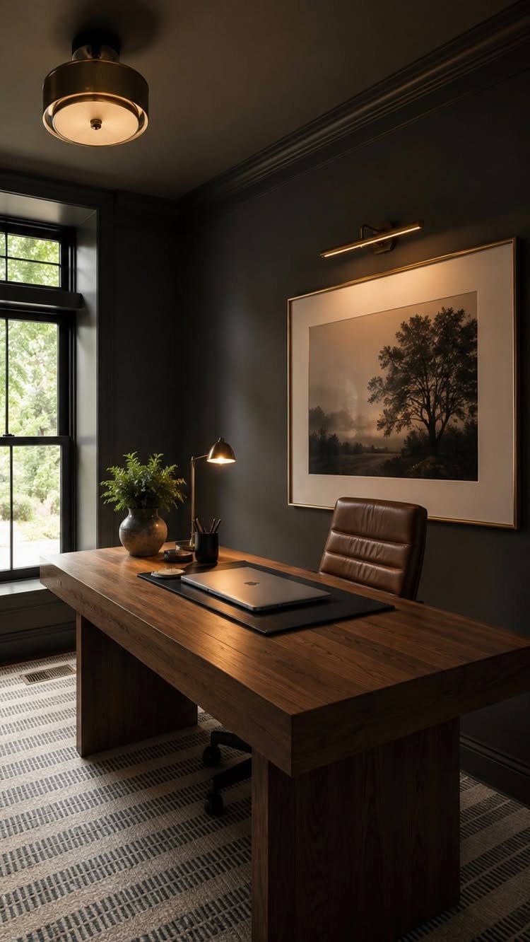
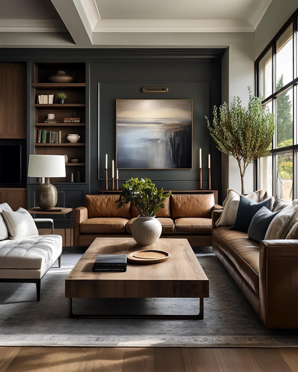
Charcoal walls with cognac leather and raw oak feel like a room someone actually sits in, not a set designed for photographs.
The warmth comes from the undertone of what you pair it with: yellow-based creams read cozy, blue-based grays read cold, and the difference only shows once the paint is up.
I start with the wood tone, then pull a cream from its grain for textiles. Black metal frames fight the warmth; brass or bare wood cooperate with it.
This is the safest dark-wall move for renters who can’t change flooring. The light furniture and warm neutrals do the balancing work that permanent features would otherwise handle.


UNIQUE PEACOCK WALL ART FOR ROOM DECORATION: These Peacock Feather Pictures adding Blue and Green colours to your home décor. Whether you want to put them in your living room, office, kitchen, hallway, or near the TV, they will complement your space with a subtle sense of art and joy.

3. Light Furniture and Dark Walls
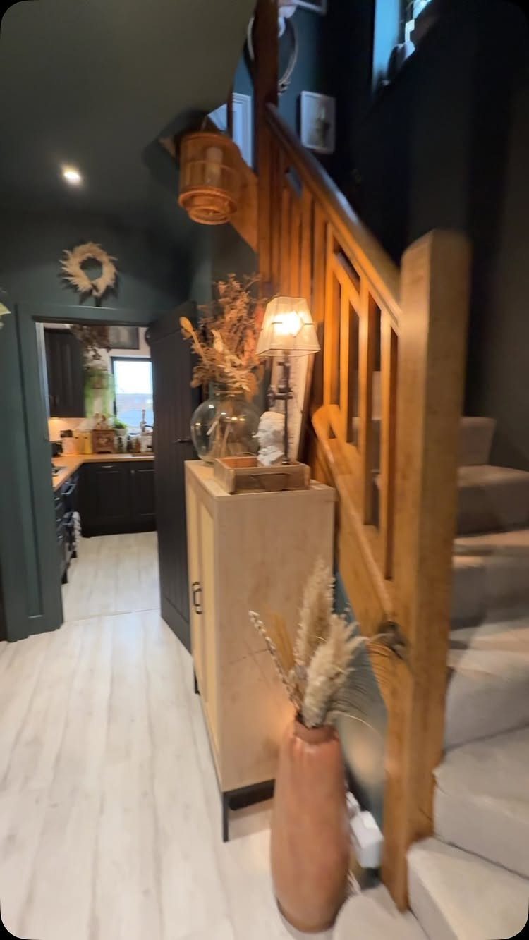
Pale wood against deep teal or charcoal creates the kind of contrast that makes a room feel larger, not smaller, because your eye travels between the two tones instead of stopping at one.
Dark walls and ceiling above, light oak below, and the eye reads it as architecture rather than decoration.
The maker of this piece switched to 2700K bulbs throughout to keep the light from going clinical against the dark. That warmth matters more than the fixture style.
Entryways and hallways suit this especially; you pass through rather than linger, so the drama works without exhausting. Bedrooms need softer transitions, more texture, less starkness.

SUBSURFACE FOR MAGNETS – Our GAUDER Metal Tape is a functional strip where you may attach various objects with the help of magnets – such as pictures, cards, drawings and plans.

Effortless Peel & Stick: Transform your home with ease using our DIY-friendly metal trim. Simply peel the backing and stick it onto any surface for an instant touch of elegance. No hassle, just cut, peel, and apply. (Please wear gloves when handling sharp metal.)

Convenient Size: Each roll measures 15mm wide by 10 meters long (0.59 inches by 33 FT), making it ideal for crafting.
4. Dark Wallpaper with Patterns
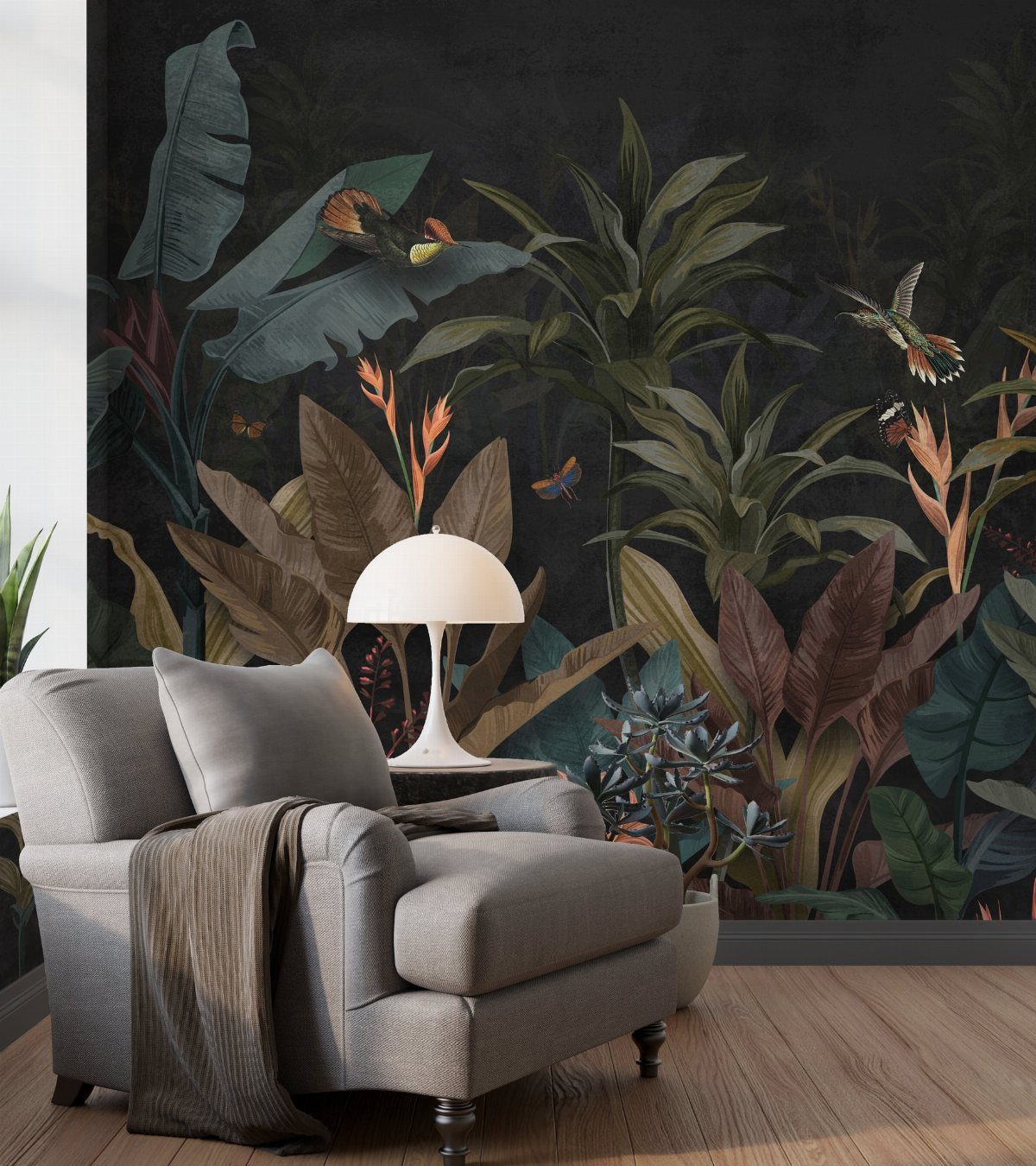
Patterned dark wallpaper does what solid paint cannot: it gives the eye somewhere to rest within the darkness itself.
A botanical print with green and brown leaves against deep ground reads as nature pressed into service, not as a wall that got away from you.
I treat the wallpaper as the single loud element and keep everything else near it quiet.
Small doses work for commitment-phobes: one wall, or the back panel of a bookcase. A whole room of pattern needs larger scale than most people expect; what reads as bold on a sample shrinks to busy across a wall.

Vibrant tropical peel and stick wallpaper with layers of green and teal palm fronds

【EXCLUSIVE DESIGN】Give Your Room a ''Visual Deep Breath'' with Soothing Watercolor Botanical. Our unique peel and stick wallpaper features soft tropical leaves and flowers in muted green and light blue, summer palette. This gentle, self-adhesive design creates a calming oasis, perfect for turning any bedroom or living room into a peaceful retreat

Design: Gold banana tree and palm leaves pattern on a dark background, like being enveloped in the moonlight of a tropical night and shining. Matte finish, high-definition print, non-fading for a long time. Straight match, pattern repeat size: 17.7"x17.7", easy to line up
5. Patterned Rugs and Dark Walls
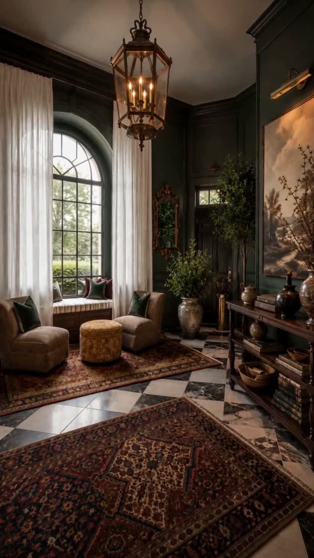
A patterned rug on dark walls adds the layer that keeps the room from feeling like a stage set.
Red and cream against deep green is the oldest trick in the book: warm colors advance, cool ones recede, and the room finds its depth between them.
Velvet, wool, or a worn antique pile all do different work. Velvet reflects light and changes color as you move; wool holds steady; an old rug with exposed warp threads adds history that new paint cannot buy.
This suits the reader who inherited good floors and wants to stop apologizing for them. Dark walls make parquet or checkerboard marble feel chosen, not leftover.

Excellent Dimmable Performance: G9 2700K LED Bulb 4W compatible with various dimmers, allowing brightness adjustment from 0%-100% with simple, effective, flicker-free operation

Dimmable G9 LED Bulb 4W: G9 Bulbs are compatible with various dimmers. These bulbs can adjust the brightness from 0%-100%, which are simple, effective, flicker-free.

Help Care for Your Eyes: Philips EyeComfort LED bulbs are designed to be comfortable on your eyes, with no visible flicker or glare
6. Paint Built-In Shelving
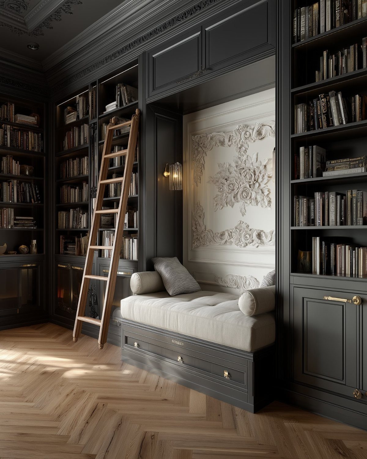
Painting built-ins the same dark tone as the wall behind them turns storage into architecture. Painted shelves disappear as objects and read as recesses carved into the wall itself, which makes the contents, not the carpentry, the point.
I prefer satin or eggshell on shelves; flat paint marks too easily when you’re sliding books in and out.
The rolling ladder in this library is oak left natural, and that single light element keeps the whole composition from going monastic.
This works best when you already own the thing being painted. Built-ins that came with the house, inherited bookcases, or rental units you can’t remove all become features rather than problems with two coats of dark paint and a weekend.

🏠Details: 15.8x78.8 Inch, total 8.65 sq.ft (40cmX2m). Self adhesive(no extra glue needed). Made of durable vinyl. Charcoal marble contact paper peel and stick waterproof. Oil proof. Fully removable.
ALL-IN-1 PAINT & PRIMER: A hardy multi-purpose and multi-surface one-coat paint and primer in one for almost any indoor or outdoor surface. A wall, ceiling, floor, skirting board, cabinet, furniture and door paint for your bathroom, kitchen, home and garden.
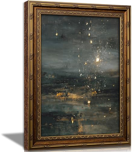
【Gothic Celestial Art Print】This canvas print of a starry night depicts a evocative impressionistic night sky: golden stars bloom against a deep blue-green and charcoal gray background, their soft light reflected gently on the water below. The richly textured brushstrokes and shimmering gold accents skillfully blend dark preppy style, retro aesthetics, and abstract beauty to create an ethereal and enchanting artwork. Quiet and captivating, it adds warmth and mystery to any wall.
7. Metallic Accents and Dark Walls
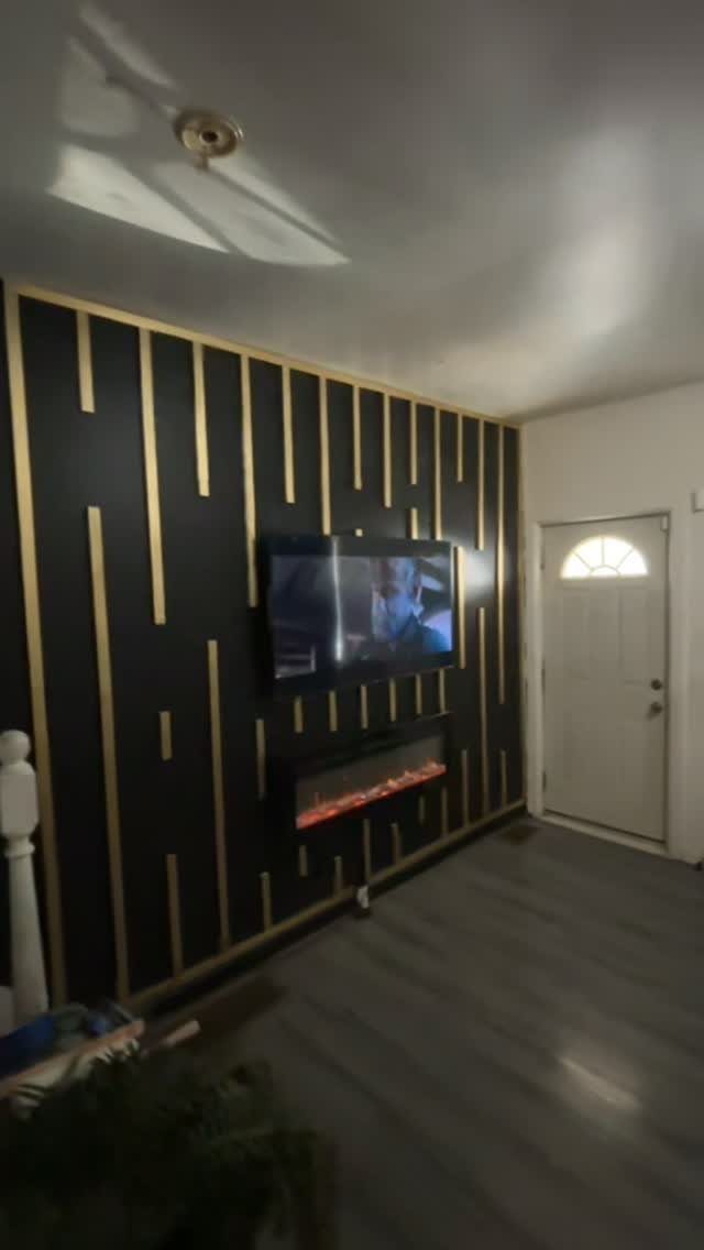
Gold strips running vertically over black turn a wall into architecture without adding actual molding. A TV wall with metallic lines running through the dark paint draws the eye without needing any extra art.
Brass reads warmer and more traditional; silver or chrome goes cooler and more industrial. The finish you pick should talk to your light fixtures and hardware, not fight them.
Thin strips keep it modern, wider bands read art deco.
This one suits renters who can use peel-and-stick metallic tape and remove it later. Paint the strips on instead if you own the place.
ALL-IN-1 PAINT & PRIMER: A hardy multi-purpose and multi-surface one-coat paint and primer in one for almost any indoor or outdoor surface. A wall, ceiling, floor, skirting board, cabinet, furniture and door paint for your bathroom, kitchen, home and garden.
ALL-IN-1 PAINT & PRIMER: A hardy multi-purpose and multi-surface one-coat paint and primer in one for almost any indoor or outdoor surface. A wall, ceiling, floor, skirting board, cabinet, furniture and door paint for your bathroom, kitchen, home and garden.

Modern Teal and Grey Dandelion Butterfly Wall Art: This teal and grey dandelion butterfly canvas print enhances your home decor. The modern minimalist design blends blue green flowers, a butterfly, and a soft grey abstract background canvas wall art, making it perfect for adding a touch of elegance and natural inspiration to your living room, bedroom, bathroom, or office.
8. Dark Fireplace Wall
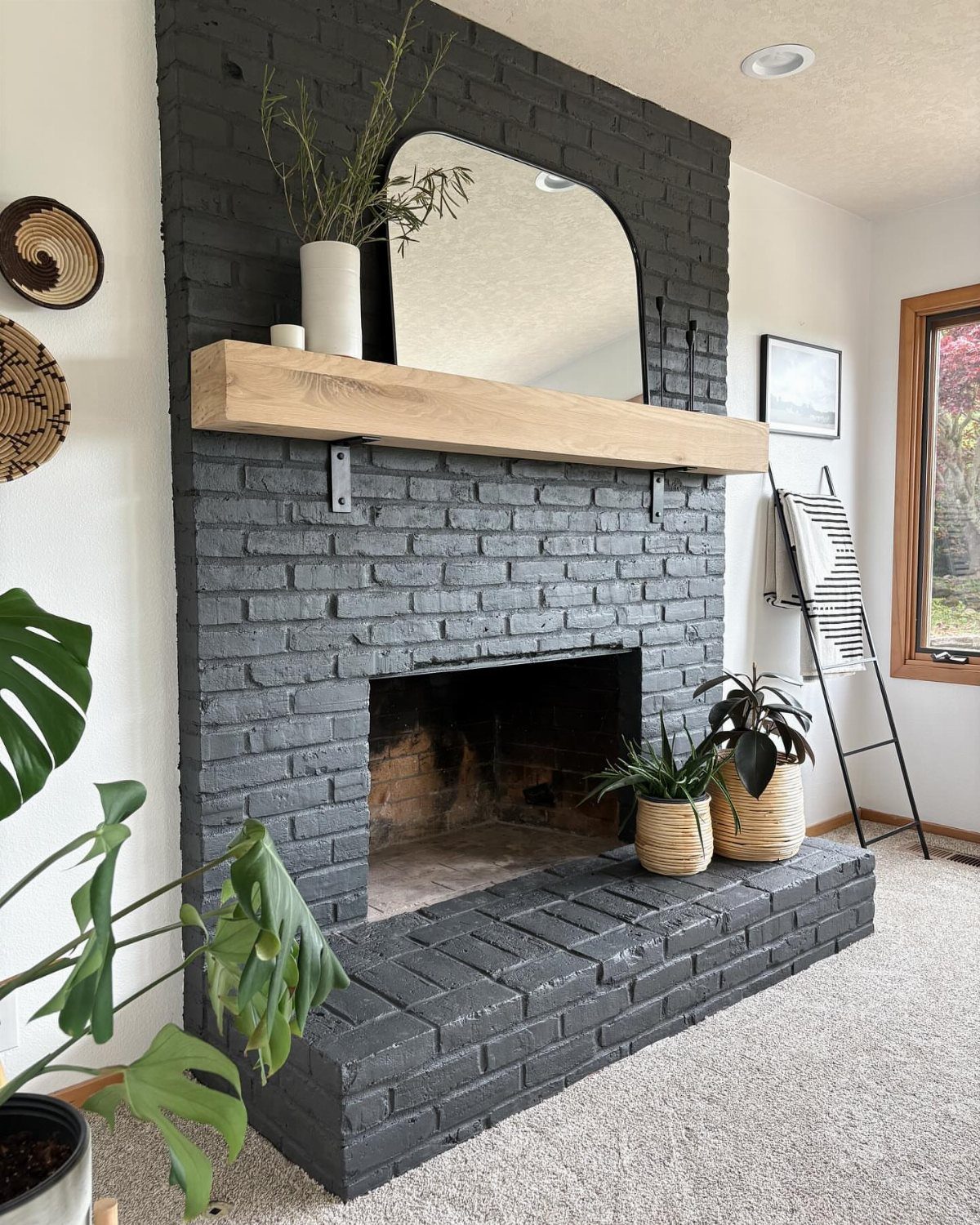
Charcoal brick with a pale wood mantel gives you the drama without the severity of solid black. An arched mirror above the fireplace breaks up the dark mass and throws light back into the room.
Paint the whole surround, including the firebox frame, one shade so nothing interrupts the surface. Or keep the brick natural and paper only the wall above the mantel if the fireplace itself has texture worth saving.
Houseplants on the hearth soften the edges either way.
The dark color eats the TV if you mount one there, which matters more than most people think until they try it. Check your mantel height first; too low and the mirror fights the television for the same eye line.

Wear Resistant and Anti Rust: our gold tape is made of quality PET material, featuring glossy, bright and vibrant effect, reliable and reusable, and not easy to deform, allowing you to use it with confidence

Package: You will receive 1 rolls gold trim peel and stick tape, each roll is 10 meters long and 0.65mm wide, the number of meters can meet your needs for mirror trim and wall decoration. Note: First, gold trim tape is not a gold ribbon, it is adhesive; second, to avoid odor, please let it sit for a while after opening

Plenty of choices: We offer a variety of sizes, Length 9.8ft/32.8ft , width 1.97/3.94/7.88/15.75/23.63/31.5 in. Meet the decorative needs of different room walls. You can also flexibly cut and shape them according to specific needs, giving free rein to your creativity and showing your unique charm and taste
9. Gallery Wall with Dark Walls

A dense cluster of frames on dark brown almost vibrates, the way colors do against velvet in a jewelry case. Gold frames do the warm work against dark paint; black or white frames would read more gallery, less collected-over-time.
Mix sizes heavily, keep the spacing tight, and let one medium dominate so it does not look like a yard sale. All oil paintings, or all sketches, or all mirrors with a single print tucked in.
The wall color does the unifying; the contents need discipline of their own.
This is the move for inherited art that clashes everywhere else. The dark swallows the frames and lets the images speak.

BOTANICAL PEEL AND STICK WALLPAPER:This sage green botanical peel and stick wallpaper features layered sage green, teal green, and olive leaves with soft cream stems, peach berry florals, and delicate floral details on a muted light background for a fresh natural look.

𝐏𝐫𝐨𝐝𝐮𝐜𝐭 𝐃𝐞𝐭𝐚𝐢𝐥𝐬: Tropical wallpaper, features green palm leaves in beige background, complement farmhouse, boho, or minimalist aesthetics. Made of sturdy vinyl, thick, durable, roll size is 17.7 inch wide by 118 inch long, covers 14.5 Sq. Ft. each roll, straight match

【BOTANICAL DESIGN】:The Amiya green/orange/pink/beige/red flowers PVC wallpaper has a colorful color scheme, with a variety of green leaves and bright flowers intertwined in a design that catches people's eyes and makes them feel the vitality of plants, making the home full of vitality.
10. Black Ceiling
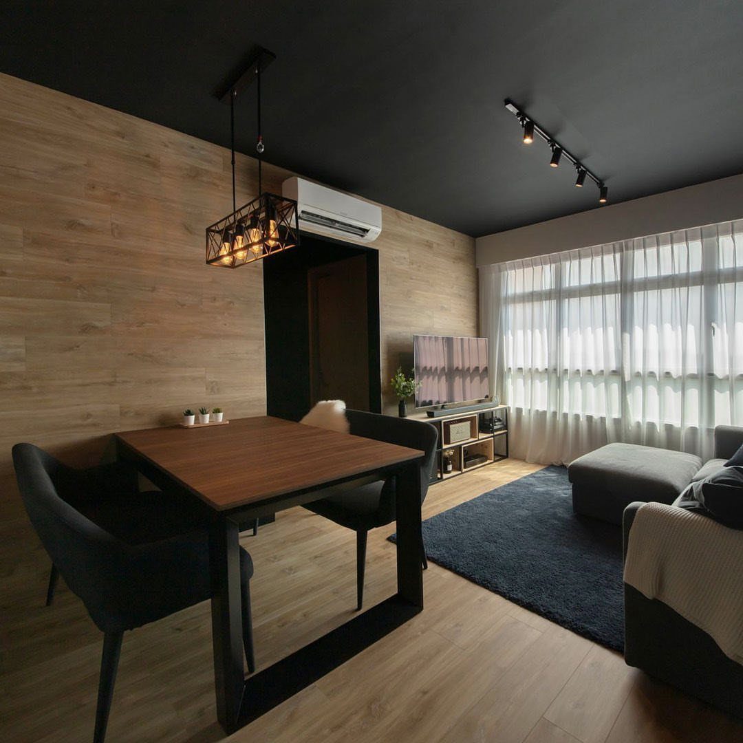
Black overhead in a room with pale walls and light wood floors feels like a night sky held at arm’s length. Sheer curtains pulling daylight through an open plan keep a black ceiling from dropping on you.
Small rooms gain intimacy; large ones gain focus. The risk is a cave effect, so you need actual light sources, not just window light.
Recessed cans, a pendant, or even LED strip where wall meets ceiling. Matte paint hides imperfections better than satin.
I would not try this with walls darker than off-white. Gray walls and a black ceiling just feel muddy and unresolved; the ceiling needs real contrast to read as intentional.

2700K Soft Warm White Lighting: The right candelabra bulb can transform your home’s ambiance. Our chandelier bulbs emit a bright, natural 2700K soft white light with a 360-degree beam angle, offering comfortable illumination with a Color Rendering Index (CRI) of 90+. This high CRI ensures that all objects display their true colors, making them appear more vibrant. The bulbs are flicker-free and do not emit UV or IR radiation, effectively protecting your and your family's eyes
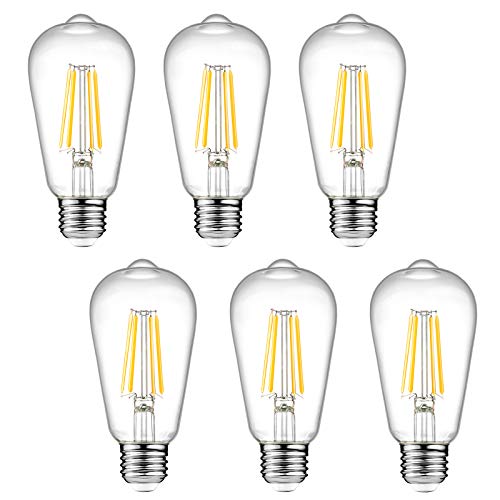
Efficient LED Bulbs: Ascher E26 LED light bulb has 20,000 hours average lifespan. Replace 60W incandescent bulb by 6W LED, save over 90% on electricity bill of lighting
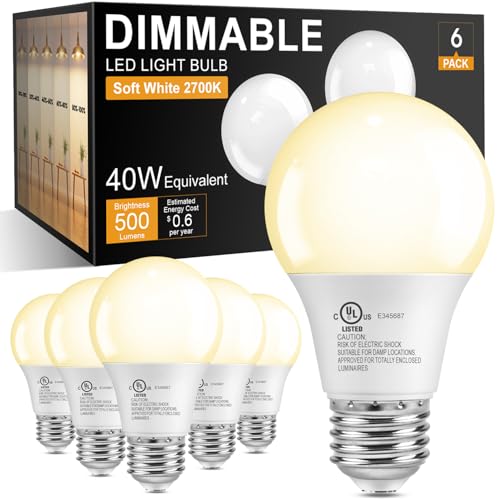
Dimming Range 10%-100%: Dimmable LED light bulbs compatible with most LED dimmers for smooth dimming. Compatibility Note: Best performance with LED dimmers. May flicker with halogen dimmers at low settings. Not for 3-way fixtures. Adjust brightness to control your space's look and feel
11. Mirrors and Artwork on Dark Walls
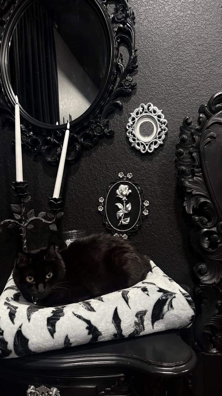
Ornate black mirror on black wall, with black cat below, sounds like too much until you see it. Texture carries a dark wall: a carved mirror frame, a subtle wall pattern, a blanket with its own geometry.
Three blacks, three surfaces, none of them flat.
Candleholders in white or brass would add another beat; the photo keeps them white and quiet. Framed pieces smaller than your hand work here because the dark swallows the frame and leaves only the image.
Bedside is the forgiving place to test this. You look at it lying down, in lamplight, when the day is done.
Fail there and you close your eyes; fail in the living room and you stare at it through dinner.
12. Use Dark Colors to Create Depth
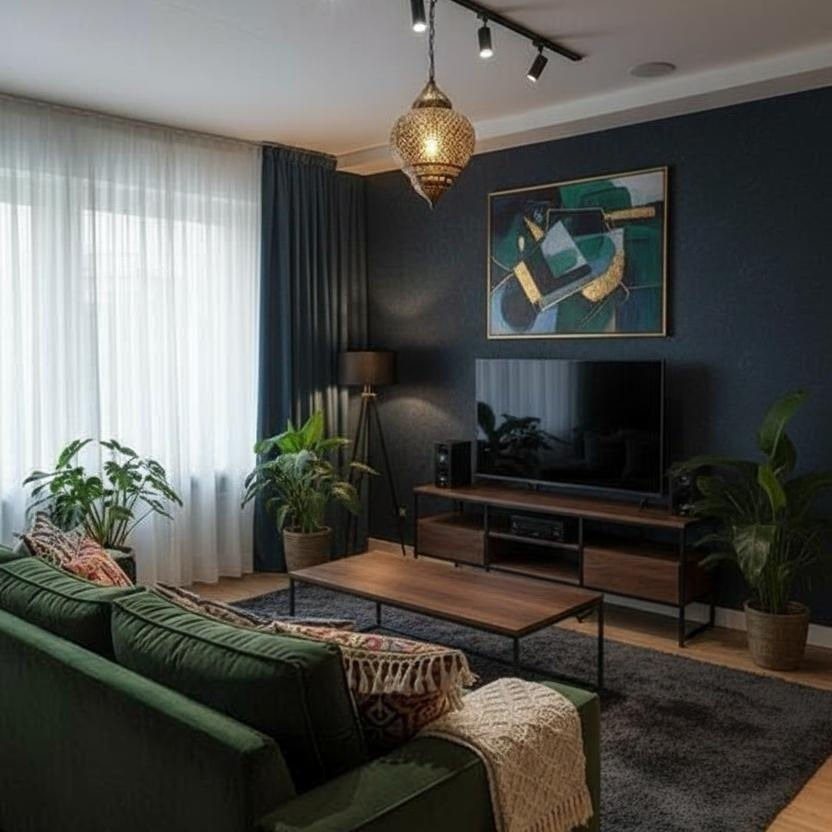
Navy deep enough to near-black pushes the wall back visually and lets the green sofa advance. A dark back wall does receding work that makes a room feel larger than its footprint while lighter pieces hold the middle ground.
Balance with wood tones that have warmth, not ash. A mid-tone media console anchors the space; pale oak would float too much and lose the weight.
Any deep color works this way, not just navy. A bronzed gray suits earthier rooms where true blue would clash.
Half-dark reads as dirty wall, not intentional space; you have to commit to the depth for it to work.
13. Use Dark Colors for Cozy Atmosphere
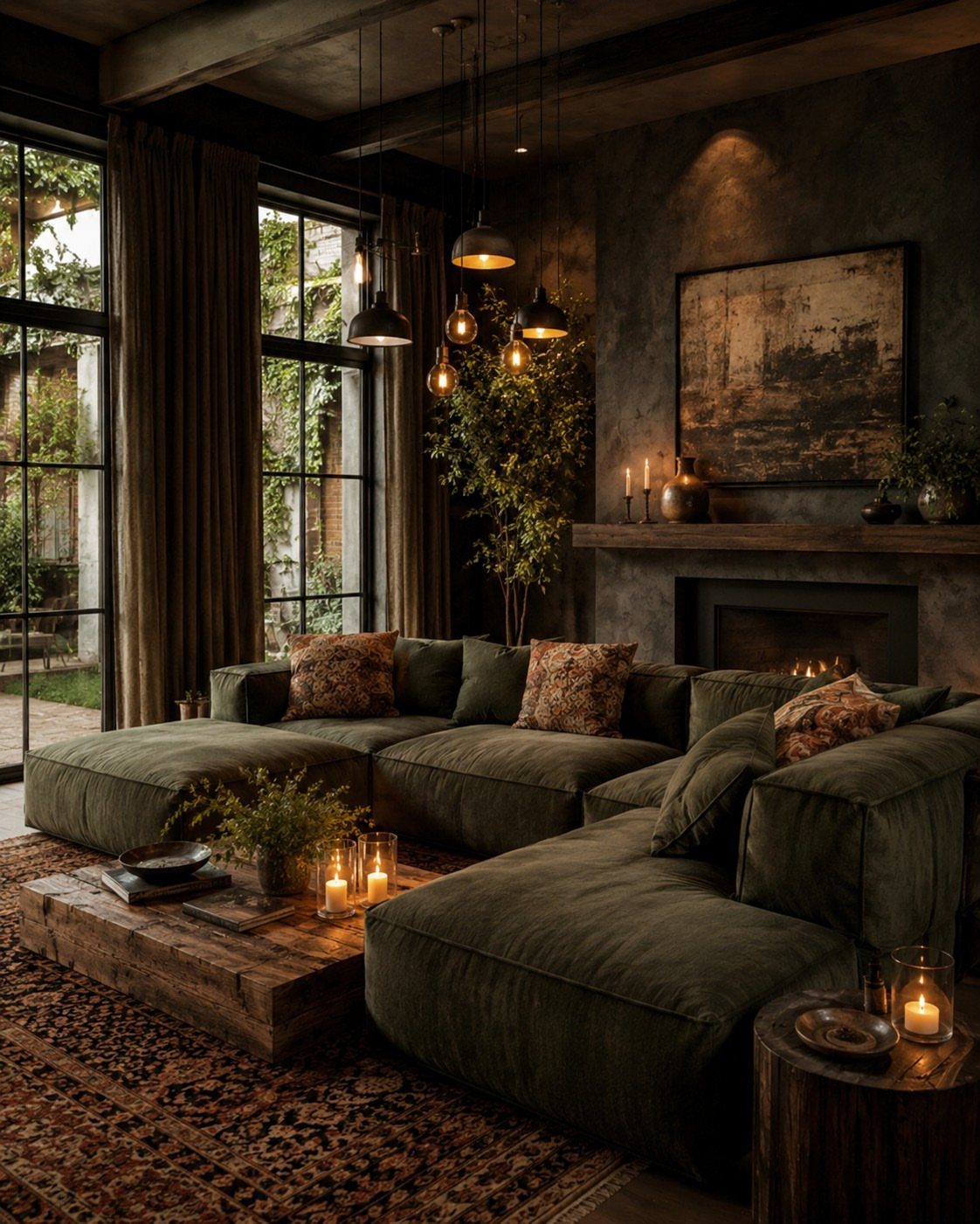
Dark walls wrap a room like a heavy blanket, softening every edge and detail into something calmer.
A tone that reads warm rather than cold does the work: a greyed bronze if your room already leans earthy, a deep charcoal with brown undertones if you want near-black without the starkness.
I would not go flat matte in a space meant for relaxing; a little texture in the paint or on the wall itself catches candlelight and lamp glow the way a flat surface never does.
Check your room after dark, when you actually use it. If the wall disappears into shadow, add a second light source lower than the first.
Small rooms suit this best. The coziness becomes intentional instead of cramped.
14. Dark Walls in Workspaces
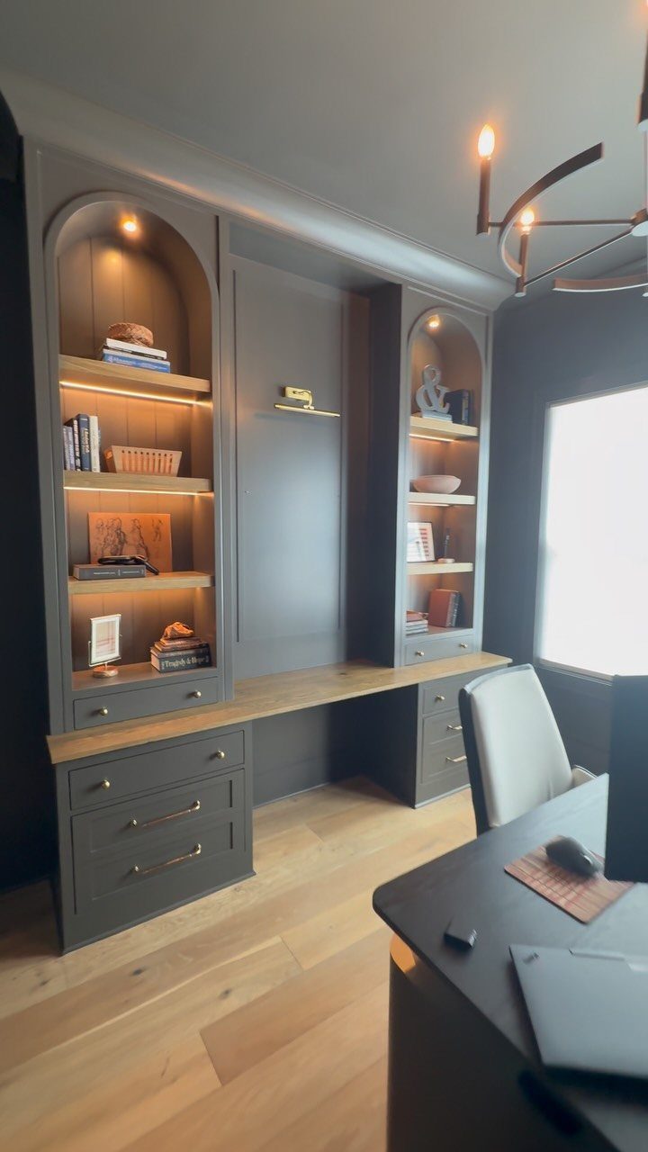
A dark wall behind a desk changes how the screen feels: less glare bouncing around, more focus on what is in front of you.
Deep teal works if you need the wall to feel alive; black or charcoal if you want the monitor to fade into the background the way television camouflage works.
Built-in shelving in the same dark tone, with a wooden desktop, keeps the storage from reading as clutter.
I would not go dark on every wall in a home office unless the room gets strong natural light; one wall behind you or to the side is enough to sharpen attention without closing the space in.
Check your video calls: a dark wall behind you reads professional, but a window behind you does not.
Best for someone who gets distracted by visual noise. You will need a desk lamp even on bright afternoons.
15. Natural Wood Tones and Black Accent Wall
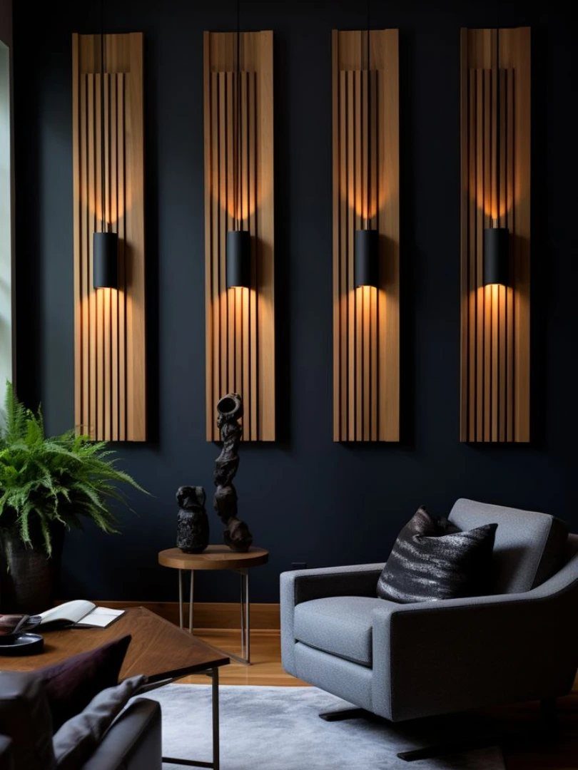
Vertical slats in light wood break a black wall into something gentler without losing the drama. Panels that sit in front of the dark surface, not flush with it, create shadow lines that shift as you move through the room.
Sconces mounted on the slats read as warmer than overhead light because the wood diffuses the glow.
I would match the wood tone to existing floors if you have them; otherwise, pick the lightest wood in your furniture and repeat it here.
Floating shelves in the same tone work as a simpler alternative if full panels feel like too much project for a weekend.
This suits renters who can patch a few screw holes later better than those who cannot touch the walls at all.
16. Dark Moldings
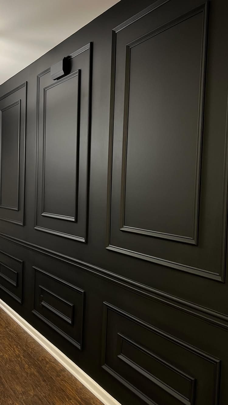
Ornate molding reads as traditional in white and turns almost modern in matte black because the shadow swallows the detail until you are close enough to notice it.
Picture frame molding, chair rails, wainscoting: paint the wall and trim the same dark color so the architecture becomes texture rather than outline. I would not mix molding styles on one wall; pick one and repeat it.
The raised trim catches enough light to keep the wall from reading as flat. Check your ceiling height first: elaborate molding in a low room can feel like the walls are leaning in.
Best for someone who inherited good bones and wants to emphasize them without a full renovation.
17. Dark Accent Wall in Bedrooms
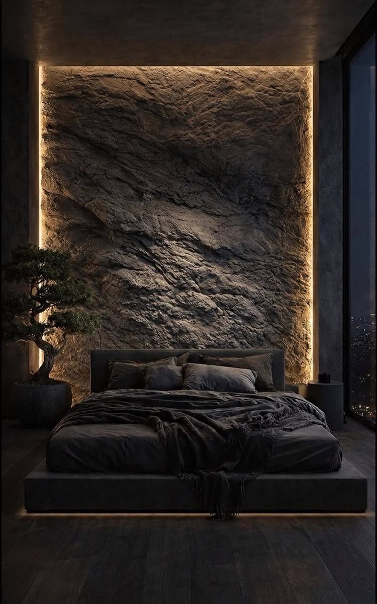
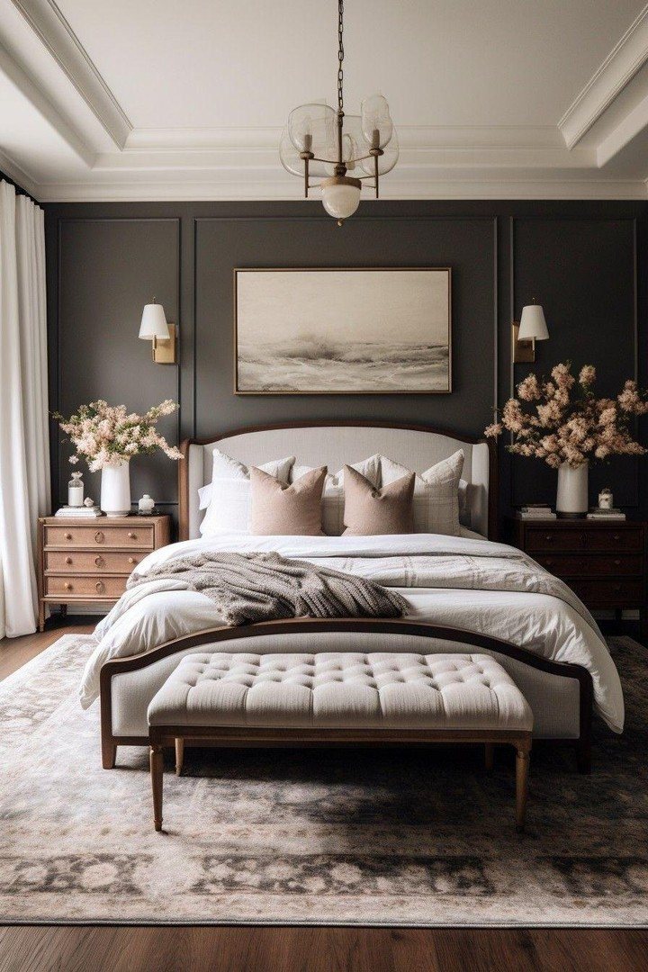
A dark wall behind the bed replaces a headboard and frames sleep as an event. Deep green reads as outdoorsy and calm; plum feels more formal and cocooning.
A hidden LED channel washing upward creates depth that a bedside lamp cannot, even with flat paint instead of textured stone.
I would keep bedding in a lighter tone so the bed does not disappear into the wall; charcoal sheets against charcoal stone loses the shape of where you rest.
One of the makers behind these photos asks readers to rate the feature, which tells you how much the drama carries the room.
Small bedrooms benefit most. The dark wall erases the boundary and lets the bed feel centered in something larger than the floorplan allows.
18. Dark Walls in Dining Rooms
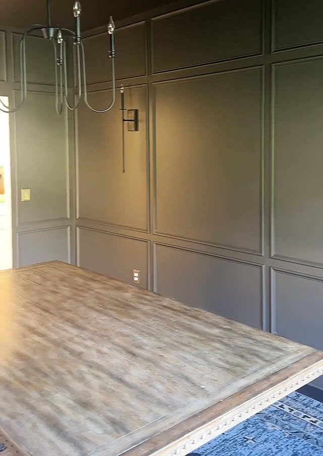
Dark walls in a dining room signal that this is a place to stay, not pass through.
Burgundy or dark brown warm the space in a way black cannot; they also hide the scuffs and splatter that lighter colors show after a few months of actual meals.
Picture frame molding in the same tone adds formality without crossing into stuffy.
I would test the color at night under your actual chandelier or pendant; dining rooms mostly exist after sunset, and a color that reads rich at noon can turn muddy under warm bulbs.
Green works too, especially in an open plan where it quietly marks where the eating happens.
Best for someone who hosts dinner parties more than weeknight scrambles. You will need stronger bulbs or more fixtures than a white room would demand.
19. Dark Living Room Wall with Fireplace
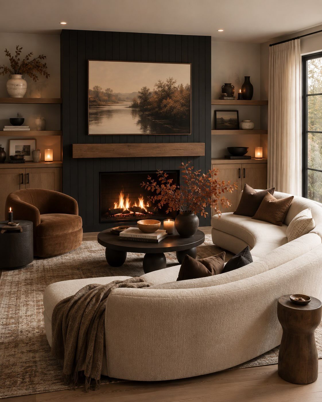
A fireplace wall in deep navy or charcoal gray turns the room’s natural focal point into something that actually holds your attention.
The dark surface recedes, so the fire and anything you hang above it read sharper and warmer by contrast.
Paint the wall, not the mantel, if you want the architecture to stand out in light wood or white.
Built-ins on either side in the same dark tone keep the look quiet and intentional rather than like a single dark patch you ran out of energy to continue.
This suits rooms where the fireplace already sits dead center and you want evenings to feel contained and calm. The trade is morning light: south-facing rooms handle it best, and north-facing ones need lamps you turn on deliberately.
20. Dark Floral Wallpaper
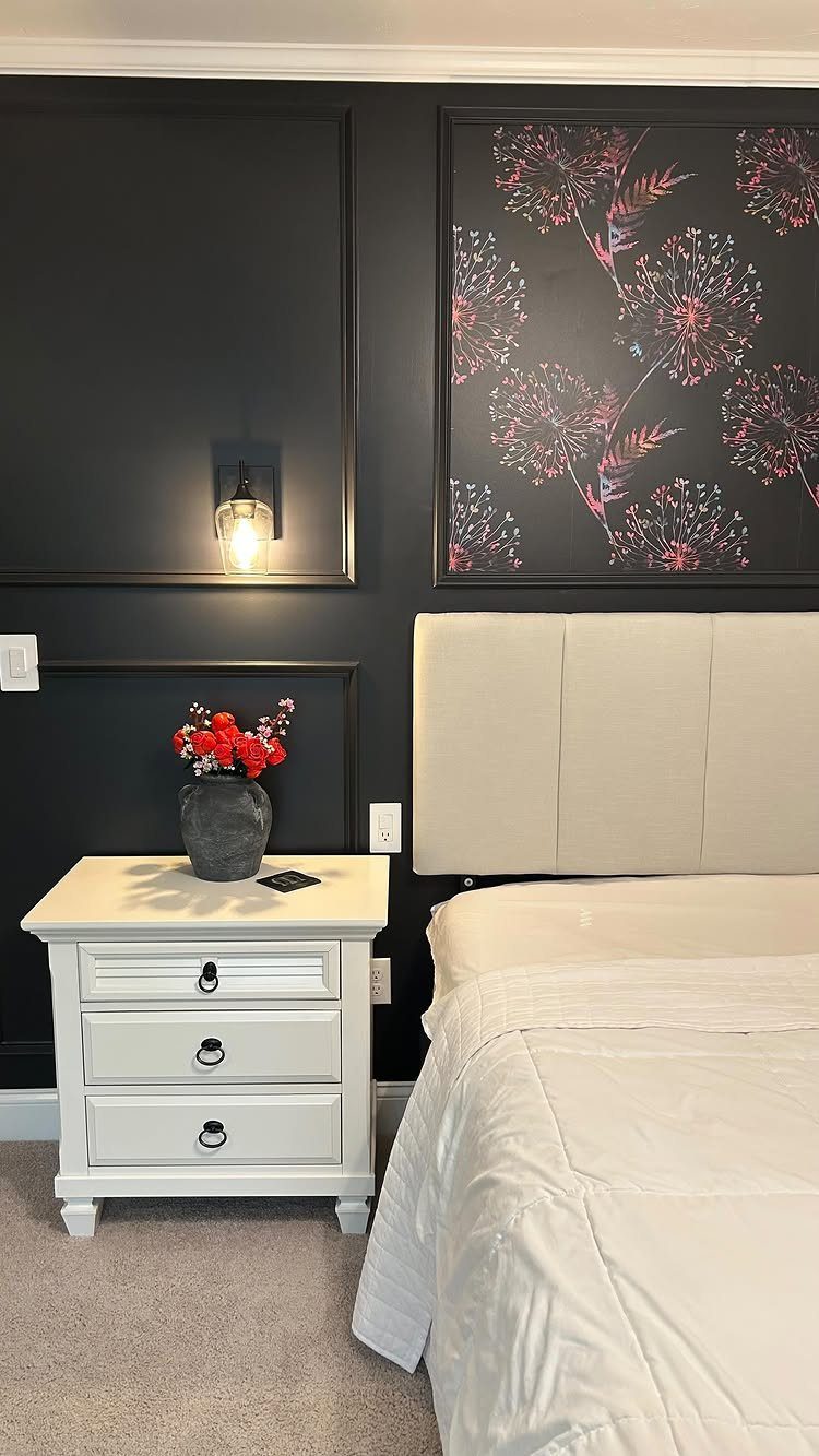
Dark floral wallpaper behind a headboard gives you the drama of a black wall without the flatness. The pattern adds texture, and the muted palette keeps it from reading too feminine or too busy for a room you sleep in.
A framed panel installation, rather than papering the whole wall, keeps the cost down and the commitment low. You can swap it later or take it with you if you rent.
Position it so the bed frame or headboard overlaps the bottom edge slightly; it looks built-in, not like a poster you hung too high.
Gray and blue motifs on a black base soften the boldness just enough for someone who wants coziness, not a cave.
Best for bedrooms with some natural light and bedding in cream or oatmeal tones that pick up the lighter colors in the print.
Choosing the Right Shade
Charcoal, navy, forest green, oxblood, and deep brown each carry a different weight in a room.
Natural light is the first filter: a south-facing window turns navy almost coastal by noon, while the same color under a north light reads as midnight.
Room size matters less than people think; a small bathroom with a skylight handles black better than a windowless den twice the size.
Existing decor is the tiebreaker. A sofa with yellow undertones fights a blue-based charcoal and finds peace with a brown-leaning gray.
Benjamin Moore’s online tool lets you upload a photo and test the color against what you already own. I would order 3 samples minimum and live with each for 2 days, checking morning, evening, and under lamplight.
The shade that holds its character across all three is the one.
Accessorizing Dark Walls
A dark wall without layers reads as unfinished, not bold. Large-scale artwork does the bridging work between high-contrast colors: an oversized piece above a bed unites a black wall with surrounding white ones and softens the drama without diluting it.
Mirrors do different work than art. They break the flat surface and throw light back into corners that paint alone would absorb.
I would mix one mirror with framed pieces rather than clustering either alone.
Texture prevents the eye from sliding past. Velvet cushions, nubby wool, or even a ceramic vase with its own shadow line add depth that a dark wall cannot supply by itself.
The wall is the backdrop; the objects are the reason for looking.
Balancing Dark Walls
White, cream, or light gray sofas against a dark wall keep the room breathing. The contrast reads as intentional architecture rather than a color mistake, and the pale pieces advance visually to claim their space.
Opaque drapes and dim lighting push the same room toward evening retreat; swap them for sheer panels and the wall becomes a bright backdrop instead. The furniture does not change, but the room’s identity does.
I would avoid matching dark walls with dark floors unless the ceiling and at least 2 large surfaces stay light.
The balance needs distribution, not just presence: a pale rug, light wood trim, or a single white bookcase can carry as much weight as a whole pale wall.
Impact of Lighting
Natural light softens dark colors and makes them inviting; limited light intensifies them toward richness or gloom depending on the hour. The same charcoal that glows at 10 AM can flatten to near-black by 4 PM in a north-facing room.
Artificial light matters as much as sun. A 2700K bulb warms navy toward something livable; 5000K leaves it cold and institutional.
I would test paint samples with the actual bulbs you plan to keep, not the hardware store’s fluorescent rows.
Skylights and large windows let a black wall act as contrast rather than cave. In their absence, you need more lumens than calculation suggests: a floor lamp and a desk lamp where one might seem enough.